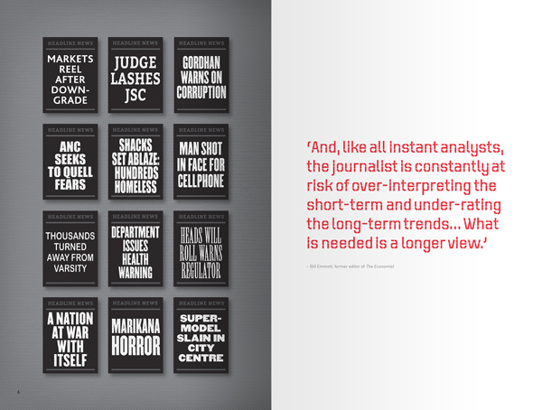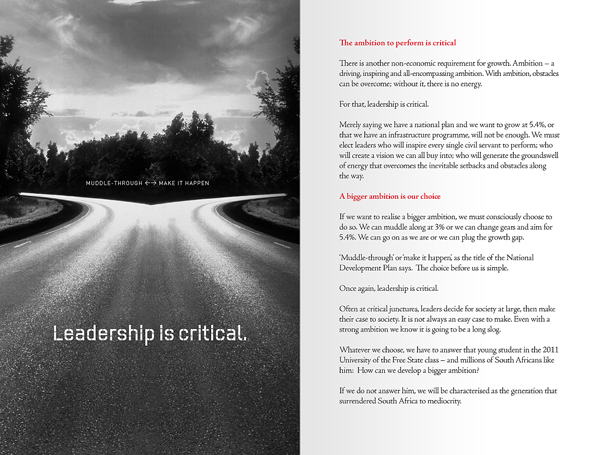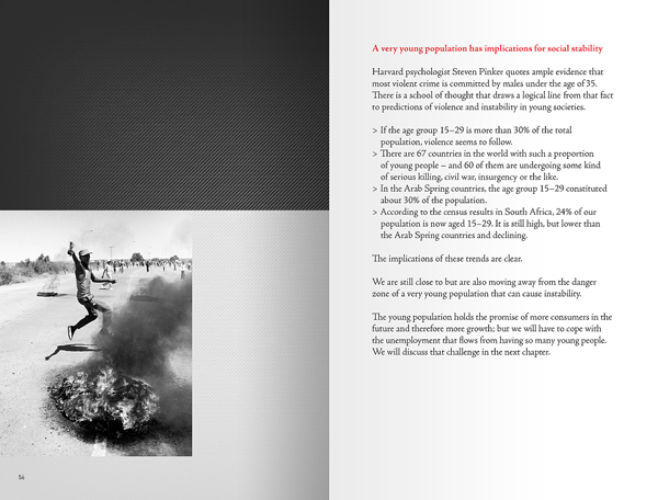
How much do you understand South Africa? Is the country better off than it was? What are the prospects for the future? What is life going to be like? We turn to the news for information, but the news tells us what happened while we were sleeping or while we were working. As in any country, it’s about the short-term drama. We don’t see the bigger picture. Most South Africans lack an in-depth awareness of the enormous strides we have made. Today, (in contrast to the notion that the country is on the verge of collapse and implosion) South Africa is a much better place than it was twenty or thirty years ago.
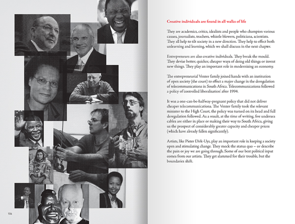
South African analyst/economist JP Landman believes we need a firmer grip on reality and a broader perspective is vital. He calls it ‘The Long View’. The zest of his book? Yes, a lot of things are wrong in South Africa, but an enormous number of important things are coming right. In this important book he motivates the power of incrementalism. On balance, incrementalism will, in all probability, make South Africa a much better place in about twenty or thirty years from now. The book is designed in such a way that the factual based content is easy to grasp for the man in the street. Here are a few random spreads that give you an idea of how the book looks and feels. Published by Jacana Media / Stonebridge Books 2013 South Africa / No1 Bestseller at Exclusive Books South Africa