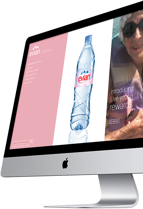
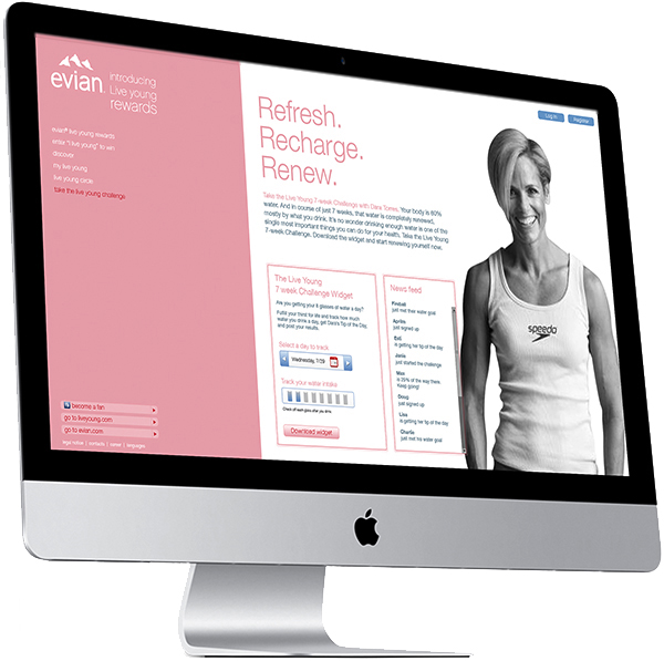
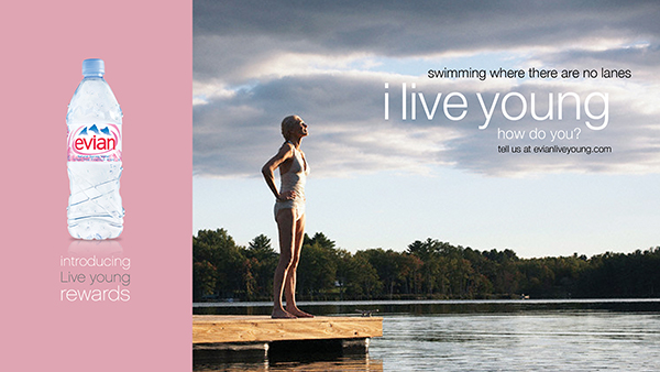
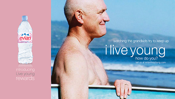
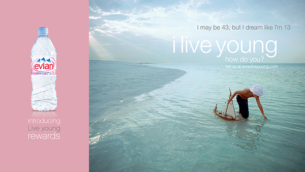
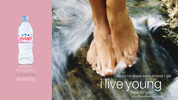
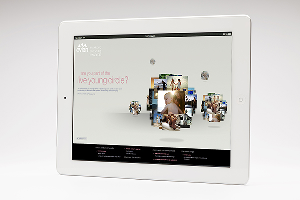
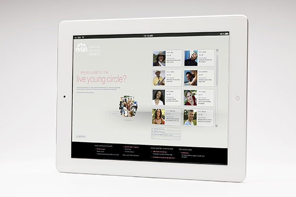
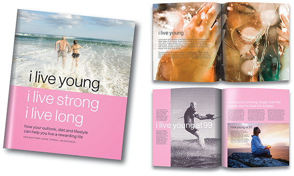
Corporate identity

Art Directors Club Netherlands

Our logo proposal for the Art Directors Club Netherlands (ADCN). The circular typeface we designed for the letters is an engaging solution in itself, but when the letters are combined as expanding concentric circles they express the ADCN’s mission to promote, stimulate and expand the influence of creative excellence in the Netherlands.

Advertising · Web / Interactive design

The School of Architecture and Planning

For over 80 years now, the University of the Witwatersrand School of Architecture & Planning has a reputation for grooming architects and planners to the point where they can successfully start pursuing their careers – and follow in the footsteps of some of the world’s finest the school has produced over time. Every year, the Johannesburg-based School tries to attract the most imaginative student candidates – the ones who dare to think different – although they still have lots to learn. These talented students have various options to where they like to pursue their studies; universities in Cape Town and Stellenbosch also have reputational architecture faculties, but for Wits University, the quest for talent has become an annual obsession. This year we developed an intriguing ‘call for entries’ campaign of internal posters, flyers, advertising, social media, and we revisited the School of Architecture & Planning micro-site too. 3D photo retouching by Victor Enrich. Copy by Mark Varder.

wits1wits2wits3wits4

Corporate identity · Graphic design

Instruments true to the instruments that made the music

Logo identity and communication platform for Sonor Audio Speaker Systems, a passionate Johannesburg loudspeaker manufacturer that breaks the mould by making quality products that can easily compete with some of the world’s top brands. Sonor is (and behaves like) a small, niche and artisanal ‘discovery brand’ that talks to new buyers hungry for new and authentic products. At BHAG Design, our job is to create and retain the authenticity and spirit of the brand.

Sonor’s robust, equally levelled logo design tells the story of Sonor’s quest for perfection. At the centre of it all, the empirically derived Ohm technology – with unique capabilities to beam separated stereo sound – is further crafted with a high degree of symmetry and precision. On balance, in our view, the logo reflects both beauty and brains.

‘Whatever It Takes’ is Sonor’s basic communication platform. It tells the story of the relentless pursuit to perfect sound reproduction; the technology and craftsmanship, but also the blood, sweat and tears that were shed to reach the goal of producing a product – both in technology and aesthetics – that can compete with the best in the world. Sonors are exclusive, hand-made speakers that are made like the musical instruments themselves. The strapline: Instruments true to the instruments that made the music, captivates the company mantra and runs throughout all communication elements. Copy strategy/writing by Mark Varder

Corporate identity · Graphic design · Thinking

We help businesses reach their full potential – through the power of purpose-driven communication design

Every company needs a purpose. Something beyond making money. It needs to be driven. It needs to make a difference.

But what is your purpose? Do you have one? When you own a purpose, you stand for something that is based on clarity and honesty, promise and delivery.

Great articulation of your purpose is everything. It will set your company apart from your competitors. The work must be positive, inspiring and charismatic. It must have beauty and brains. It must catch the eye and solve the business problem at the same time.

We have strong strategic instincts with an understanding of customer experience methodology, branding and advertising. We are fluent in industry and production processes, software, benchmarks, history and conventions. We are collaborative and are able to work with teams across different markets.

For inspired and focused communication design, look no further. Our work gets continued global recognition from our peers and industry press.


Book design

The Long View

How much do you understand South Africa? Is the country better off than it was? What are the prospects for the future? What is life going to be like? We turn to the news for information, but the news tells us what happened while we were sleeping or while we were working. As in any country, it’s about the short-term drama. We don’t see the bigger picture. Most South Africans lack an in-depth awareness of the enormous strides we have made. Today, (in contrast to the notion that the country is on the verge of collapse and implosion) South Africa is a much better place than it was twenty or thirty years ago.
South African analyst/economist JP Landman believes we need a firmer grip on reality and a broader perspective is vital. He calls it ‘The Long View’. The zest of his book? Yes, a lot of things are wrong in South Africa, but an enormous number of important things are coming right. In this important book he motivates the power of incrementalism. On balance, incrementalism will, in all probability, make South Africa a much better place in about twenty or thirty years from now. The book is designed in such a way that the factual based content is easy to grasp for the man in the street. Here are a few random spreads that give you an idea of how the book looks and feels. Published by Jacana Media / Stonebridge Books 2013 South Africa / No1 Bestseller at Exclusive Books South Africa
JPbook_Layout 1

JPbook_2JPbook_3JPbook_Layout 11JPbook_Layout 9JPbook_4 JPbook_7 JPbook_8JPbook_6JPbook_Layout 7JPbook_Layout2JPbook_Layout 14 JPbook_Layout 13 JPbook_Layout 12 JPbook_Layout 10 JPbook_Layout 6 JPbook_Layout 5JPbook_Layout 8