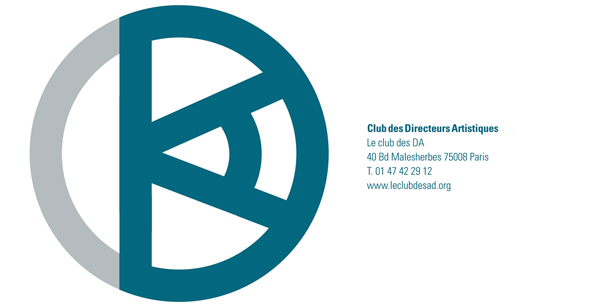
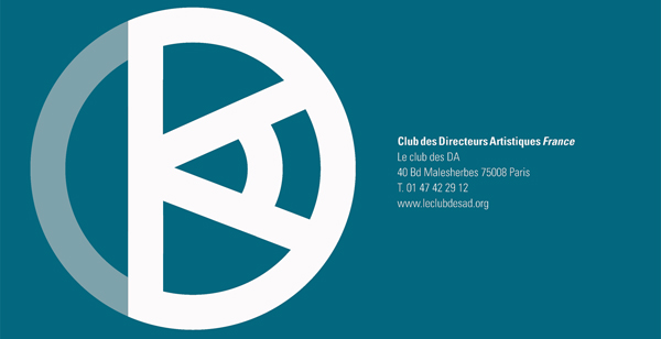
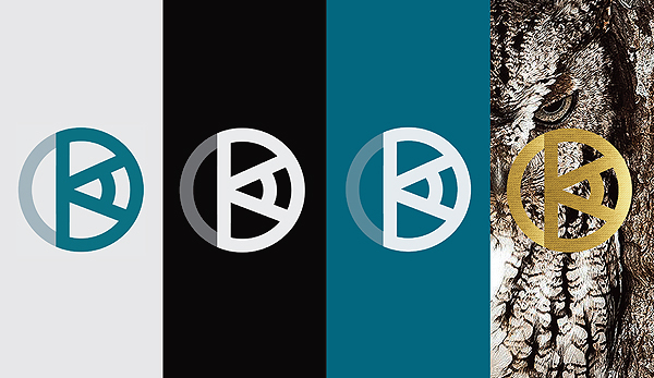
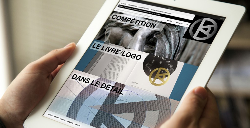
The French Art Directors Club (dedicated to educating and celebrating creative communication, rewarding its practitioners, and raising standards across the industry) came up with a design competition for a new logo; a quest for a typographic emblem that would hold the letters CDA, be premier, be visionary, be stylish, and can stand the test of time. Think I managed to include all the essentials. The project is pending. In the meanwhile, what do you think?
Design Approach: The logo for the society had to project a mature and inspirational image. The circle is intended to refer to both the ‘club’ (exclusive community) and to the ‘globe’ (the circular CDA Award which is regarded as the prime trophy in Francophone creativity). While the execution had to be clean and precise enough to convey a quality brand icon, a quirky element was introduced through the horizontal “A”, which suggest an eye / having a visionary outlook on the world of advertising and design.
