Corporate identity · Web / Interactive design

Mademoiselle

Mademoiselle is a self-propelled new business initiative for the Chico’s Fashion Group in Fort Meyers, FL, USA. Targeting the young female millennium who is highly appreciative of quality, design and appearance, Mademoiselle specialises in exclusive designer scarves and shawls.

BHAG Design created an online brand experience to perfectly complement the real-world experience of Mademoiselle. We achieved this not only through careful consideration of the company’s ambitions, purpose and values – but by gaining an intimate understanding of what Mademoiselle’s young professional clientele are actually looking for.

The softly sensuous motion of the Mademoiselle logo is made for the screen. It reflects, of course, the swirling elegance of the scarves and shawls. At the same time, the online experience (below) is everything fashion should be – contemporary and intriguing. The parallax sliding device allows women to explore their fascination with Mademoiselle’s design and quality until they are confident to make their special purchase. 

Shawl designs by Francisco Lopez


Graphic design · Web / Interactive design

Print vs Digital

What will happen to print now that digital is taking over so forcefully? Will paper only be good for folding origami? This ironic concept expresses just that. The digital revolution is under way and it has consequences for everybody. What does it mean from a marketing point of view? What are the up and coming digital platforms and which should you be utilizing to reach your audiences? These, and other issues, will be part of a vivid panel discussion of pros and cons: Print vs Digital. Invitation poster and iPad app for congress attendants. For iTV-Asia and Le Royal Meridien Hotel in Shanghai, China. Winner of the 58th Type Directors Club of New York 2020. Gold winner in Graphis Best Poster awards 2019-20. Winner Communication Arts Typography 2020.

Above: poster invitation (size 59.4 × 84.1 cm / 23.3×33.1″) Below: Print vs. Digital application for the congress with background info of guests, panel members, agenda, subjects, workshops and sponsors.

Advertising · Corporate identity · Graphic design · Web / Interactive design

Doing good in food

Mondelēz International, Inc. (NASDAQ: MDLZ) is one of the world’s largest snacks companies, with global net revenues of $35 billion in 2018. Their brand portfolio is deep and wide and accommodates a range of famous chocolate, candy and biscuits brands of which some are more than 100 years old and own market shares of more than 50% in their categories. || As one of the world’s largest food companies, the company takes social responsibility very seriously and are committed to fighting hunger and promoting active, healthy lifestyles. The Mondelēz International Foundation wants to give back and do ‘good’. It takes a collaborative approach to tackle these global problems – working with consumers, companies, governments and leading non-governmental organisations.

This uplifting logo expresses the company’s desire to show another side of their business; an important side that stands and acts with purpose, positivity and integrity. Its goal is to develop a healthier world in where all of Mondelēz’ stakeholders can trust and obtain the confidence that is so critical to the company’s future. || Deliverables: Logo, Stationery, Brand book, Brand messaging, Company collateral and widget-based Website.

mondelez1

Mondelez2

stationary

brandbookbrandbook2

newspapers

Mbillboard_08

MbrochMbroch2

Mwidgetweb

Corporate identity · Graphic design · Web / Interactive design

Ability Business Management Software > CI / UI / UX / DM

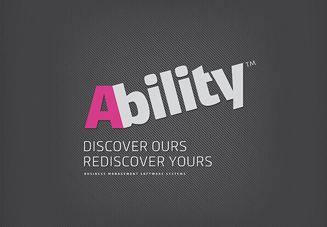
Corporate Identity, UI/UX and Direct Marketing concept and design for Ability Business Management Software. Ability™ is like SAP, but for smaller companies. Its uniqueness is found in its inspiring name. In its logo. In its communication.

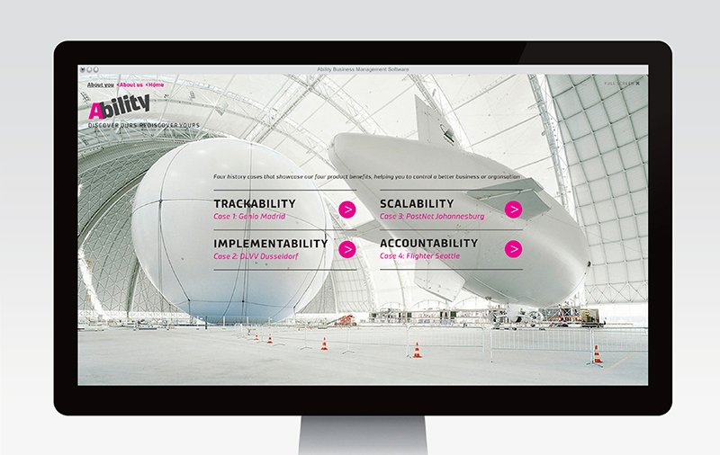
A decision about a business management system is not taken easily. It’s going to be costly and it’s going to be disruptive. Whether a new system actually works is another matter – there are many horror stories of solutions that took months to implement and of businesses which were worse off after implementation. Which solution to opt for? Considerations include (1) ease of implementation (2) scalability (3) whether the solution is Microsoft-based and (4) return on investment.

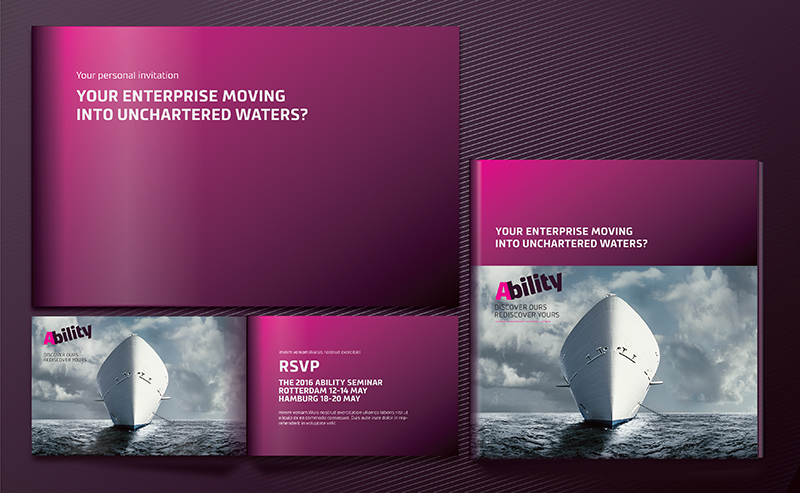
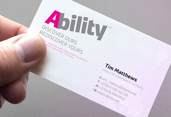
The strapline (written by Mark Varder) appeals to the SME’s who are battling to expand and grow their organisations to the next level. Jim Collins describes the problem in his book, Good to Great: “As a company grows and becomes more complex, it begins to trip over its own success – too many new people, too many new customers, too many new orders, too many new products.” Entrepreneurs find themselves bogged down in the day-to-day workings of business and can no longer do the sort of thinking which had established the company in the first place. This insight revealed the deeper problem that needed solving. We had come across Ability’s big idea. Ability. Discover ours. Rediscover yours.  

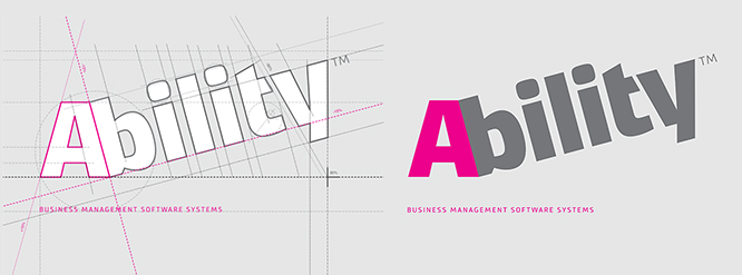
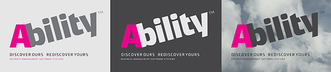
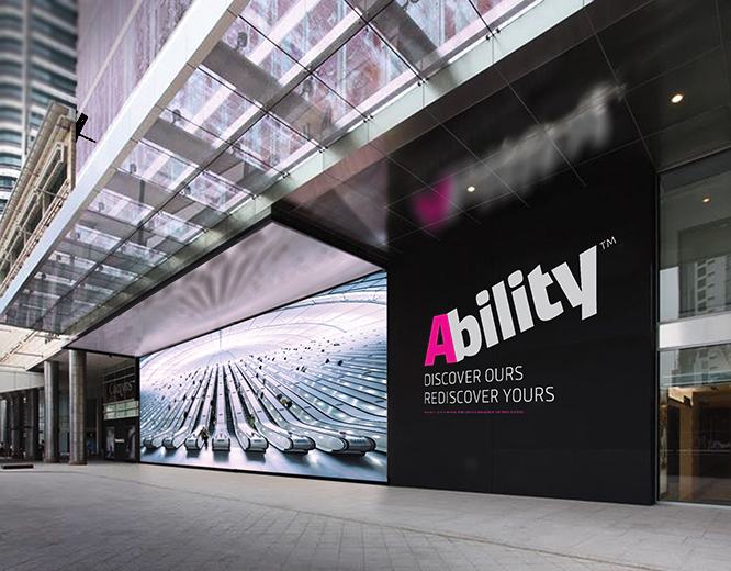
The logotype. How do you capture the positives of the word Ability and its promises for a business – like growth, progress and solidity? Answer: with a simple, bold, memorable logo design that can stand the test of time.

abilitylogo#11
abilTECH322b

abilsmall#22
AbizcardAbilityHQ

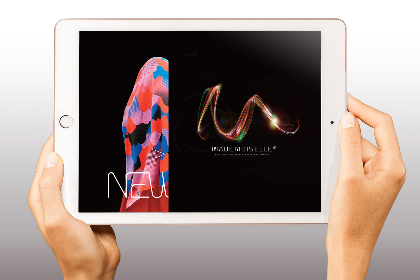
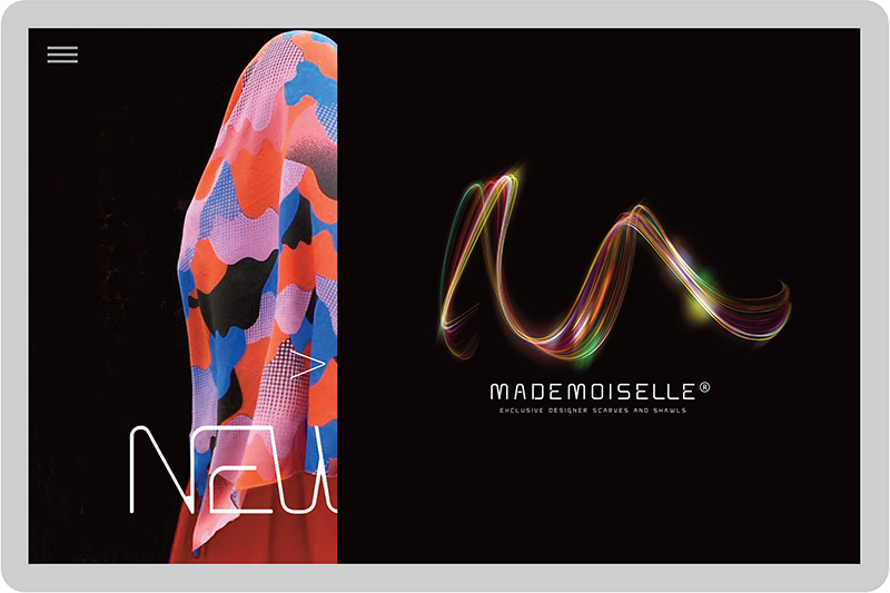
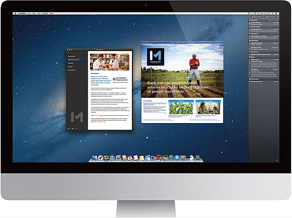
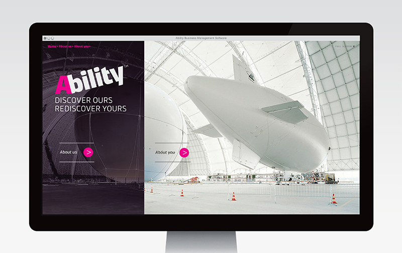
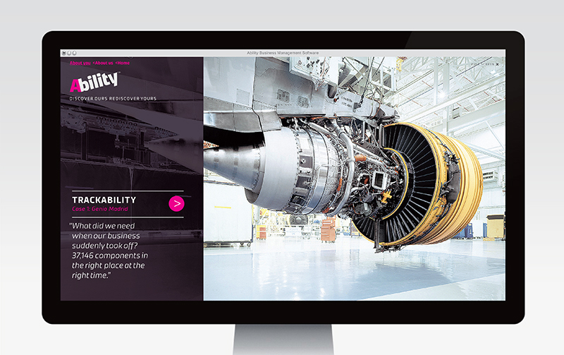
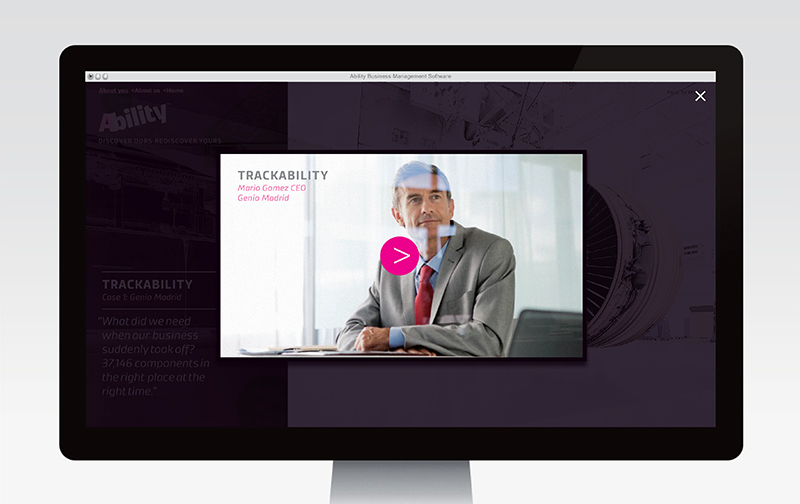
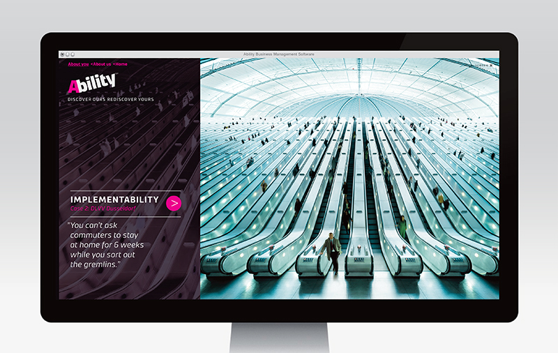
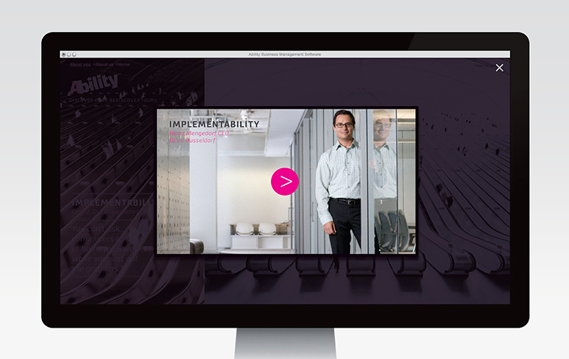
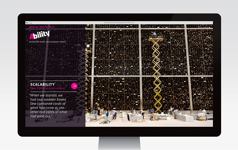
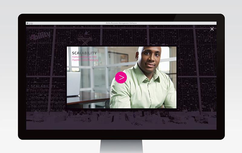
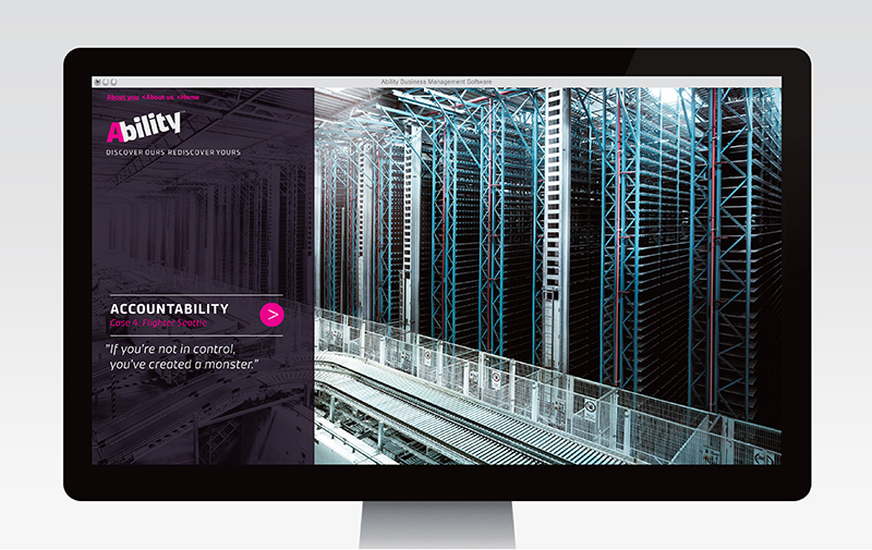
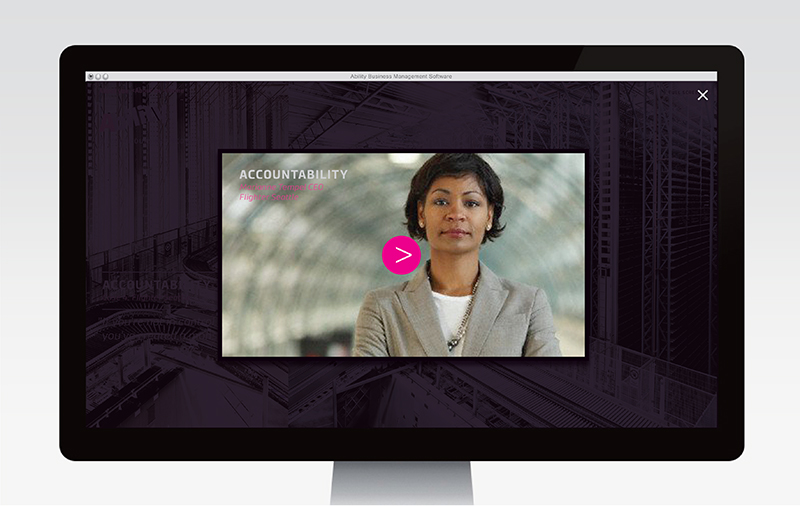
Much of Ability’s marketing is done online. The all-important Ability website contains two menus, 1. Organisational 2. Case histories. – Case histories are crucial to the pragmatist mindset of CEOs and CFOs. They add tremendous credibility to the software and a welcome reassurance that the decision to implement Ability is justified. Below, a few examples of the content we developed.

The website borrows from Christian Stoll’s wonderful large-scale photography. Christian has a knack for finding futurism in today’s techno culture. His objects undergo a metamorphosis, transforming them into visuals of tactile desire.

Layout 1_Page 6 Layout 1_Page 7 Layout 1_Page 8 Layout 1_Page 9 Layout 1_Page 10 Layout 1_Page 11 Layout 1_Page 12 Layout 1_Page 13Layout 1_Page 14Layout 1_Page 15

The Ability Seminars. Once Ability had embraced the ethos, “Discover ours, rediscover yours,” it became clear that this should become the central organising principle for the company. As a result, Ability developed its own insightful workshops for SMEs – added value for leaders who want not only to improve their businesses, but up their game when it comes to strategic and visionary thinking.

Layout 1_Page 4

Corporate identity · Graphic design · Web / Interactive design

Innocity > fascinating expeditions into Dutch innovation

Innocity offers tailor-made tours into Dutch innovation to foreign visitors and company groups looking to expand their horizons. Innovation is alive & kicking in the Netherlands. The country ranks in the top 3 of the world’s most innovative societies and you’ll find break-through examples of this phenomenon across the country. Whether you are interested in agriculture, technology, science or design, Innocity arranges a fully serviced day exploring the brave new world. Go explore!