Graphic design

Territory Records

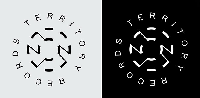
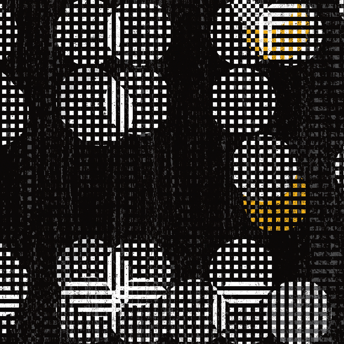
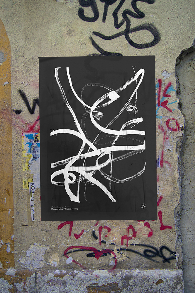
Territory Records is a Dutch Nu-Jazz label that creates, produces and distributes albums for a new generation of jazz lovers in various contemporary music fields. At Territory Records, performing talent gets the opportunity to show what they are capable of. Territory helps them in areas such as composing, producing, arranging and recording music. BHAG Design came up with the naming, developed a logo and started a line of announcement posters with a sleek black and white identity – which quickly became recognizable to the target group the company is trying to reach. Almost all new album releases have their own black and white cover and poster, several of which are available for purchase at tallmanstudio.com. An international art and poster printing company.

Graphic design

Tallman Akademie

Tallman Akademie offers a structured and comprehensive curriculum designed to foster resilience, clarity, and self-awareness in navigating life’s most complex challenges. Its programs—delivered both online and in person—combine practical training with reflective insight, equipping participants with the skills to cultivate a healthier mindset and more constructive outlook on life. In addition to individual enrollment, the Akademie collaborates with schools, colleges, and universities, supporting educators in guiding students toward practices of self-mastery, confidence, and balanced personal development. With established bases in Amsterdam, New York, and Tokyo, Tallman Akademie operates as an international platform for lifelong learning and enlightened growth.

This ongoing international abri campaign, launched earlier this year in Europe, USA, and Asia, draws on familiar life quotations to address audiences in search of personal growth and enlightenment. Through the integration of visual identity and public messaging, it seeks to provoke reflection and encourage self-development within the urban landscape. Initiated by Joost Hulsbosch under BHAG Design, the project demonstrates how design can transcend conventional branding, positioning itself instead as a medium for introspection and dialogue.


Corporate identity · Graphic design

Promoting regional culture: Theater Anoniem

Strategic concept development, logo and poster design for Theater Anoniem (Anonymous). A Flemish-speaking performance arts companionship that operates on a not-for-profit basis. It stages theatrical productions – as in plays that range from comedy to drama and is based in Antwerp (Belgium). It brings stage productions to everyone who loves to see local artistry taken to another level. Its ambitious performance repertoire has local actors on their toes and since we’ve been designing their new identity and announcement posters, crowds have been flocking to the venues. This is a pro-bono project and we work closely together with various stakeholders such as writers, directors, actors, photographers, digital artists, and printers to get our message out there.

taprofeetTA16posters26posters3 6posters4 6posters5
6posters1TA2

Corporate identity · Graphic design

A simple but compelling brief

The Corporate Identity brief for Wiseware-Micron® — the Denver based microprocessor assembly & sales startup for SMEs (supported and funded by Intel®) — was clearly defined.

Please make sure our name is somehow reflected in the icon; make clear what a processor does (connect, control and distribute information); and above all, make us look professional and trustworthy to decision makers. On top of this, a special wish from CEO Harry Wiseware: to somehow not forget about our local native American Navajo roots.

The finished logo features all of the above and overall, shows a well-balanced interplay between the two letters that surround the square microprocessor in the middle. The identity is versatile in usage and reducible to the smallest possible (chip) size. But most importantly, the logo speaks to the strength and directness needed to be memorable and successful in this highly competitive business sector. (Project development in collaboration with FutureBrand Inc. London UK)

Having created Wiseware Micron’s corporate identity, we turned our attention to their UI/UX site. If we were to enhance their business, we needed to create a site that addressed a multiplicity of end-users, from computer hardware manufacturers to b2b customers. The result is a user experience divided into 6 core markets. Visitors delve seamlessly into their solution-oriented answers, accessing the latest developments in business process optimization.

Graphic design · Web / Interactive design

Print vs Digital

What will happen to print now that digital is taking over so forcefully? Will paper only be good for folding origami? This ironic concept expresses just that. The digital revolution is under way and it has consequences for everybody. What does it mean from a marketing point of view? What are the up and coming digital platforms and which should you be utilizing to reach your audiences? These, and other issues, will be part of a vivid panel discussion of pros and cons: Print vs Digital. Invitation poster and iPad app for congress attendants. For iTV-Asia and Le Royal Meridien Hotel in Shanghai, China. Winner of the 58th Type Directors Club of New York 2020. Gold winner in Graphis Best Poster awards 2019-20. Winner Communication Arts Typography 2020.

Above: poster invitation (size 59.4 × 84.1 cm / 23.3×33.1″) Below: Print vs. Digital application for the congress with background info of guests, panel members, agenda, subjects, workshops and sponsors.