Corporate identity · Web / Interactive design

Mademoiselle

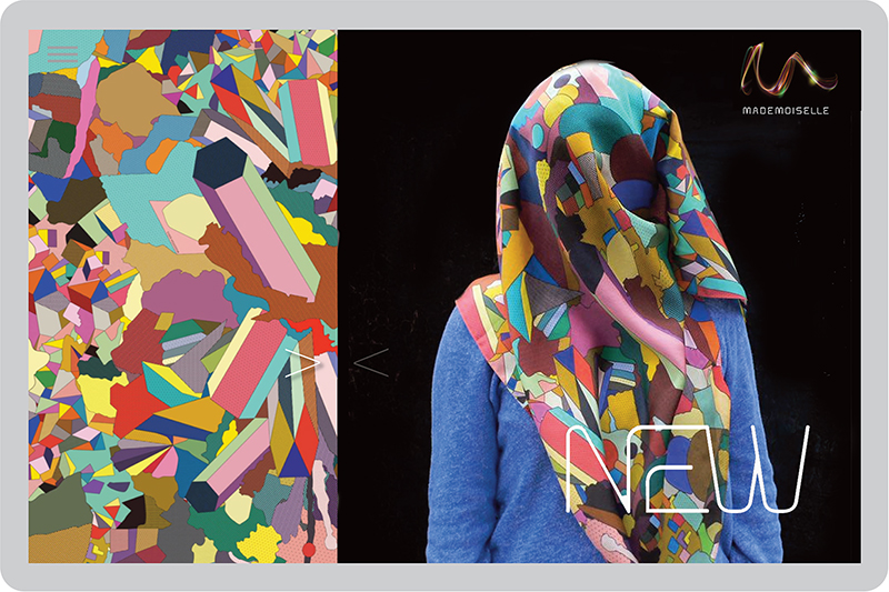
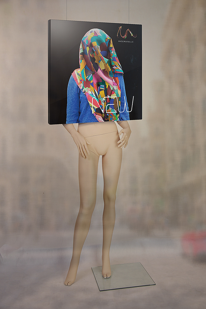
Mademoiselle is a self-propelled new business initiative for the Chico’s Fashion Group in Fort Meyers, FL, USA. Targeting the young female millennium who is highly appreciative of quality, design and appearance, Mademoiselle specialises in exclusive designer scarves and shawls.

BHAG Design created an online brand experience to perfectly complement the real-world experience of Mademoiselle. We achieved this not only through careful consideration of the company’s ambitions, purpose and values – but by gaining an intimate understanding of what Mademoiselle’s young professional clientele are actually looking for.

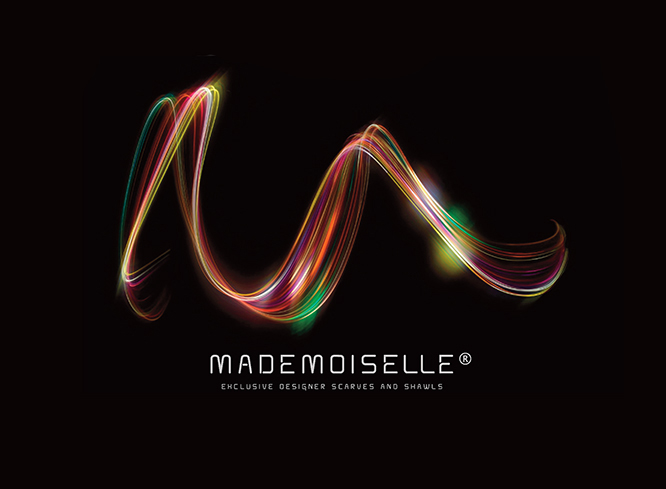
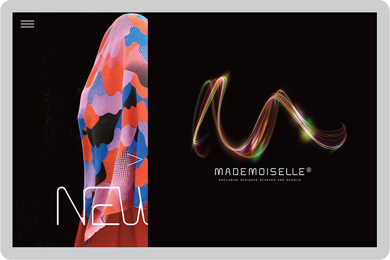
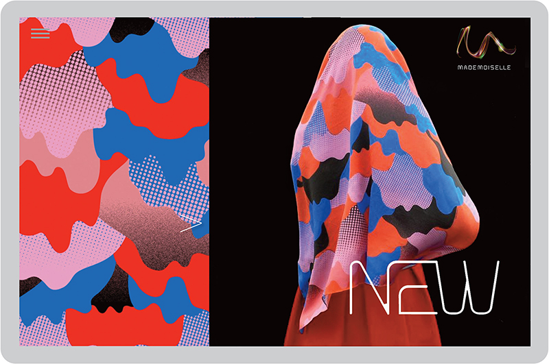
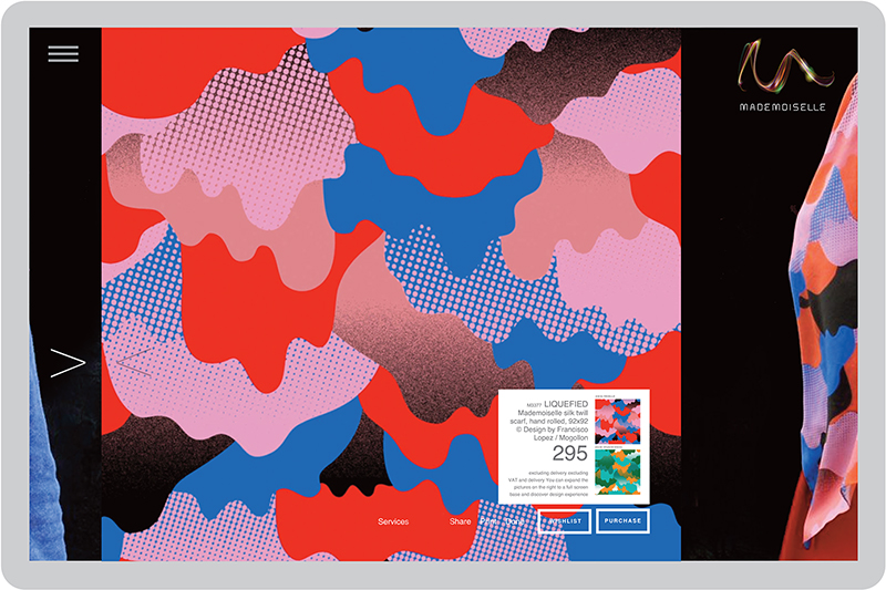
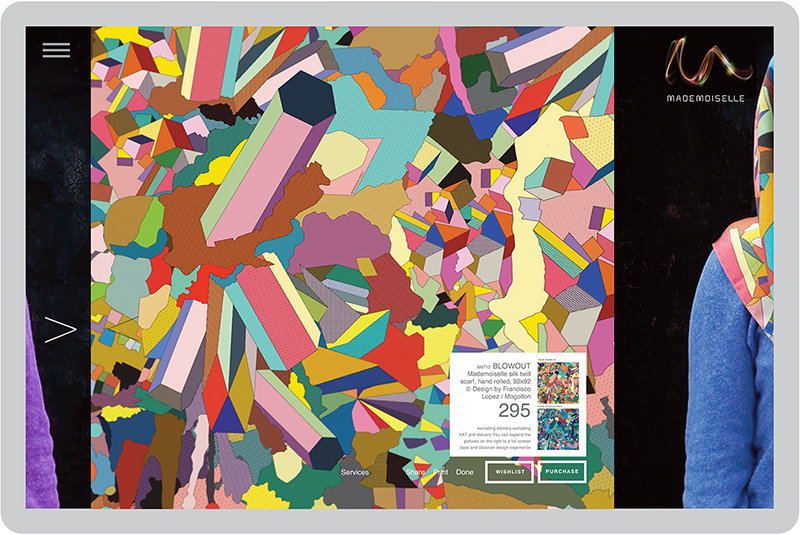
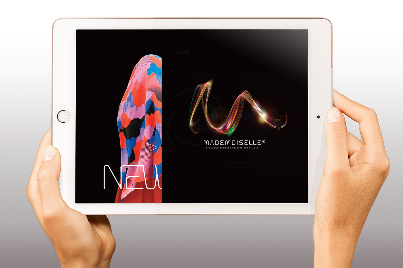
The softly sensuous motion of the Mademoiselle logo is made for the screen. It reflects, of course, the swirling elegance of the scarves and shawls. At the same time, the online experience (below) is everything fashion should be – contemporary and intriguing. The parallax sliding device allows women to explore their fascination with Mademoiselle’s design and quality until they are confident to make their special purchase. 

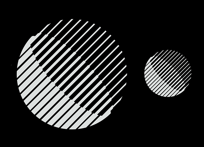
Shawl designs by Francisco Lopez


Corporate identity · Graphic design

Promoting regional culture: Theater Anoniem

Strategic concept development, logo and poster design for Theater Anoniem (Anonymous). A Flemish-speaking performance arts companionship that operates on a not-for-profit basis. It stages theatrical productions – as in plays that range from comedy to drama and is based in Antwerp (Belgium). It brings stage productions to everyone who loves to see local artistry taken to another level. Its ambitious performance repertoire has local actors on their toes and since we’ve been designing their new identity and announcement posters, crowds have been flocking to the venues. This is a pro-bono project and we work closely together with various stakeholders such as writers, directors, actors, photographers, digital artists, and printers to get our message out there.

taprofeetTA16posters26posters3 6posters4 6posters5
6posters1TA2

Corporate identity · Graphic design

A simple but compelling brief

The Corporate Identity brief for Wiseware-Micron® — the Denver based microprocessor assembly & sales startup for SMEs (supported and funded by Intel®) — was clearly defined.

Please make sure our name is somehow reflected in the icon; make clear what a processor does (connect, control and distribute information); and above all, make us look professional and trustworthy to decision makers. On top of this, a special wish from CEO Harry Wiseware: to somehow not forget about our local native American Navajo roots.

The finished logo features all of the above and overall, shows a well-balanced interplay between the two letters that surround the square microprocessor in the middle. The identity is versatile in usage and reducible to the smallest possible (chip) size. But most importantly, the logo speaks to the strength and directness needed to be memorable and successful in this highly competitive business sector. (Project development in collaboration with FutureBrand Inc. London UK)

Having created Wiseware Micron’s corporate identity, we turned our attention to their UI/UX site. If we were to enhance their business, we needed to create a site that addressed a multiplicity of end-users, from computer hardware manufacturers to b2b customers. The result is a user experience divided into 6 core markets. Visitors delve seamlessly into their solution-oriented answers, accessing the latest developments in business process optimization.

Concept · Corporate identity · Graphic design · Strategy / Concept / Design

A new CI for PRO-digitaal

PRO-digitaal specialises in servicing post-production broadcast equipment used in today’s digital studios. The company is based in Hilversum, the Netherlands. By specialising in particular types of equipment, i.e. HD colour correction, Flame, Flint, DaVinci and other cutting-edge soft & hardware products, they are able to offer faster turnaround than other service centres. What were the conditions for designing a new identity? Be smart, digital and 100% connective.

PRO-digitaal’s new corporate identity (CI) design. The linear logo design melts the letters P-R-O into one form, reflecting the integrated, highly connective environment it lives in. The company’s marketing communication appears in relevant media and is always focusing on its skilful workforce – we call them PRO’s Special Agents. Award-winner in The One Show for Design and the European Design Awards.

Corporate identity

The Simulated Sphere

Business strategy, no matter how well researched and articulated, is only as good as its execution. Many strategic consulting firms are frustrated developing strategies for clients only to see them struggle with execution. BTS Group AB in Stockholm, Sweden, is the world leader in customized business simulations that enable companies to test and try-out their business plans before anything goes ‘live’. Along the way, people practice alignment, build confidence, bolster competence and motivate action that dramatically increases the odds of winning… This BTS logo idea illustrates the business’ offering, showing one half of the sphere still in development.