Sandoz is part of the Novartis group of companies – and a world leader in affordable generic medicines. As soon as you hear the word ‘generic’, you may think the organisation simply produces copies of medicines without the cost of R&D and patenting, perhaps using inexpensive production lines. In fact, the Swiss-based company has a far more interesting approach: it develops complete new solutions to existing formulas that truly make a difference in patients’ lives. As a result, Sandoz has become a world leader in developing drug-delivery systems and complex biosimilars.
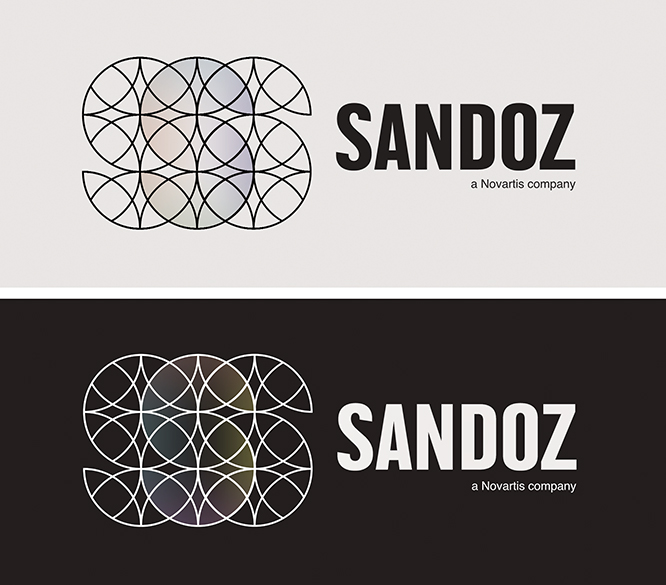
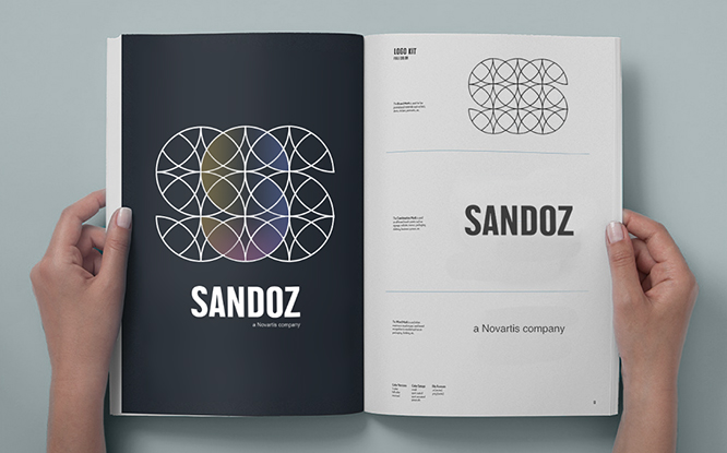
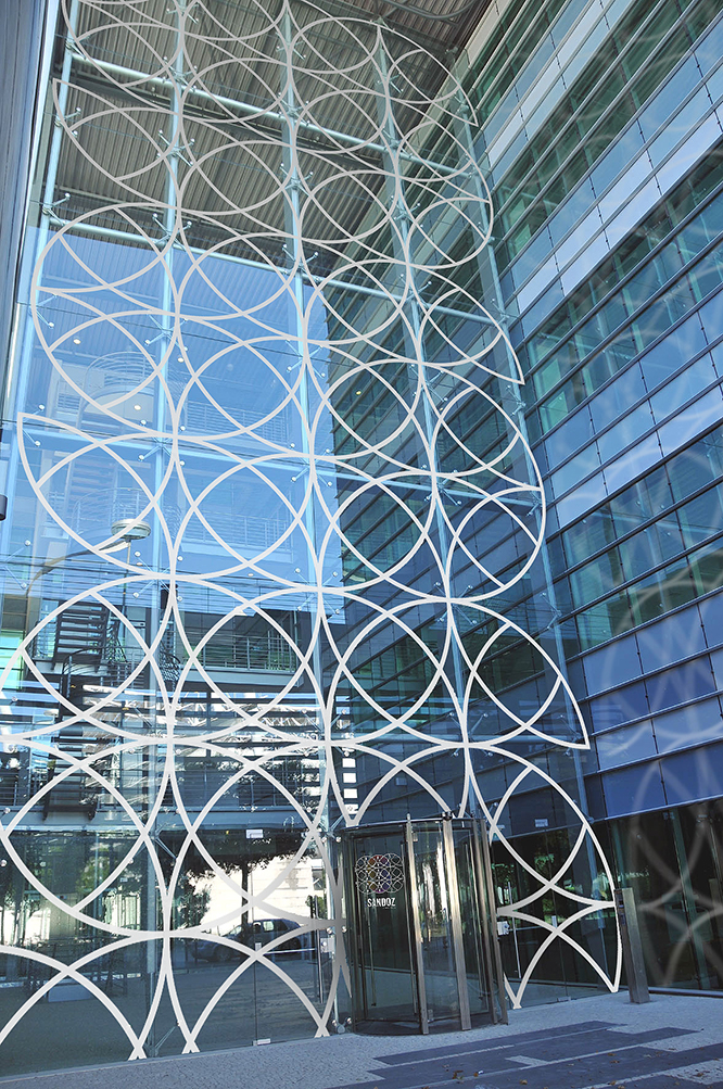
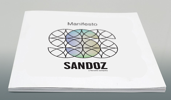
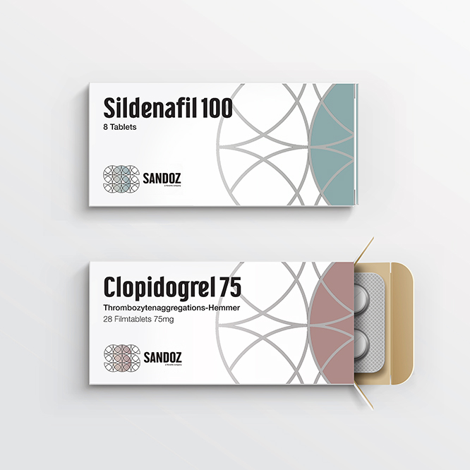
How does a corporate identity begin to reflect Sandoz’s ethos and sense of purpose? Simply, our work is a graphic ‘biosimilar.’ The primary icon is an S born out of three Ss. Repeated and replicated with Swiss precision, the identity offers the viewer a look into a company which provides 90% of the world’s population with sophisticated yet affordable medicines. A global organization with almost infinite facets.
We like to think this simple design principle provides meaning and brings Sandoz to life for customers and employees alike.