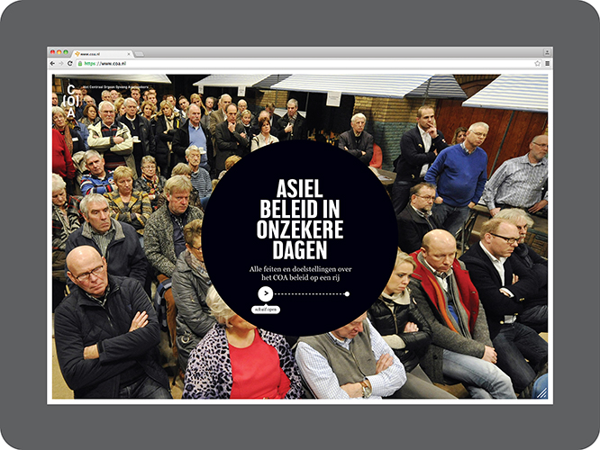
Concept, logo, UI/UX design proposal for COA, the Central Agency for Asylum Seekers in the Netherlands. The COA assures that asylum seekers are accommodated and supported in a safe environment. This is done in a manner that remains controllable to both politics and society as a whole. Although the current influx of refugees is at an all-time high – and puts the organisation under tremendous strain – it’s also felt that both identity and communication strategies need to be altered in order to communicate a more solemn stature with the nation and all of COA’s stakeholders.
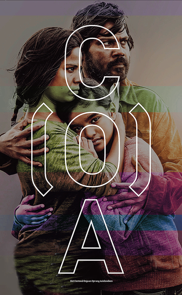
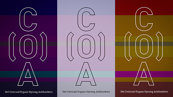
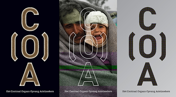
In terms of designing a new identity, the job is to express an steadfast organisation that provides safe (but sober) shelter to vulnerable human beings on the run from war and destruction. Maybe you can view the stacked letters as an abstract person standing firm, but that’s not what this logo is about. The caring accolades around the O (from Opvang = Shelter) is what the organisation in all about.
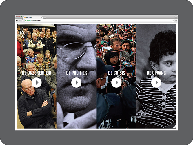
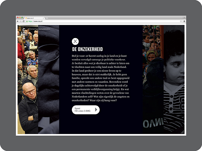
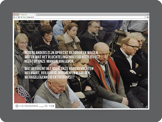
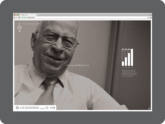
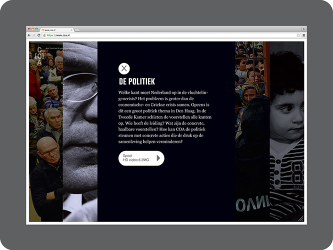
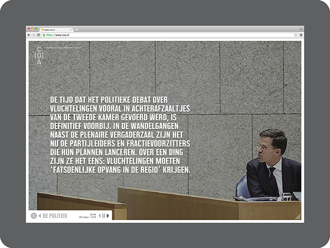
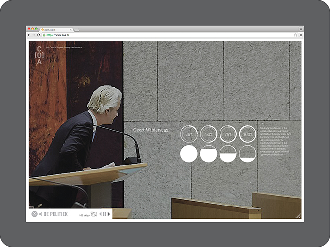
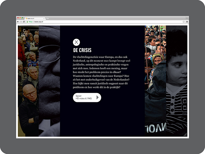
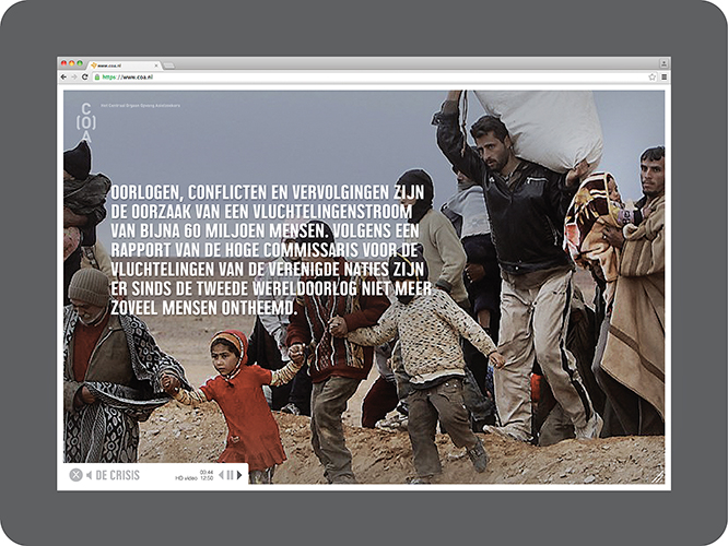
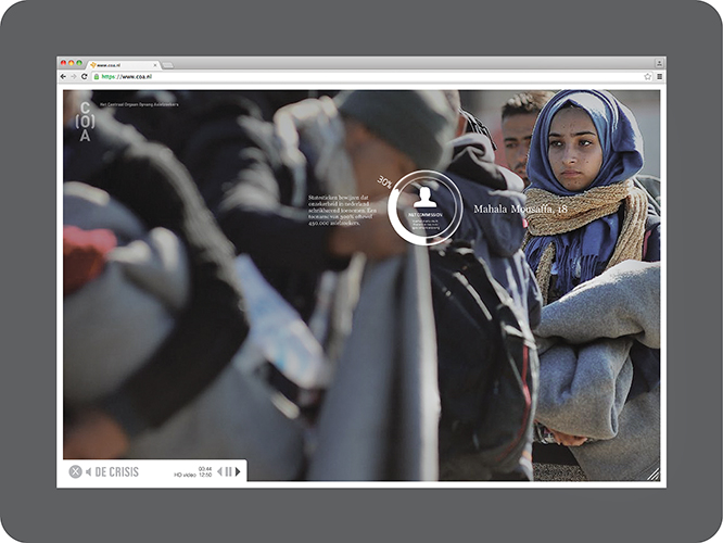
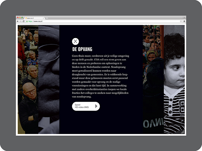
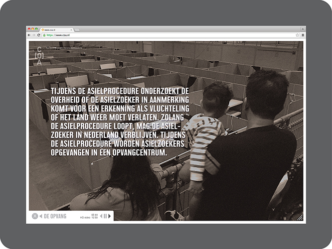
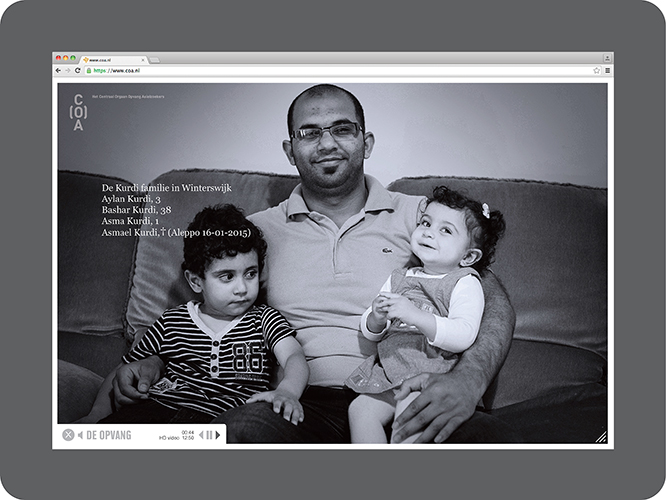
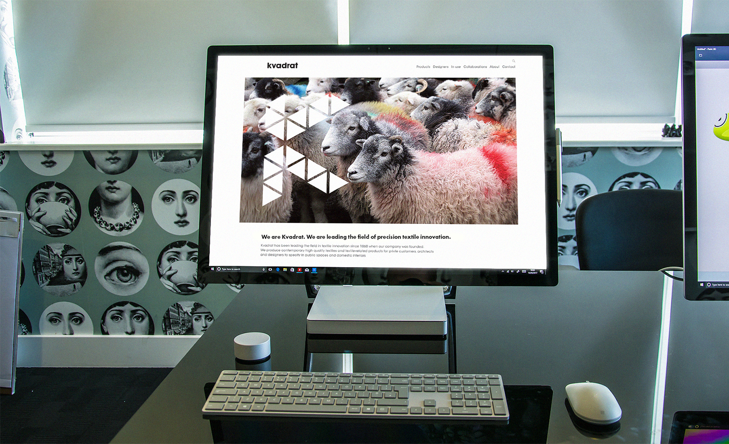
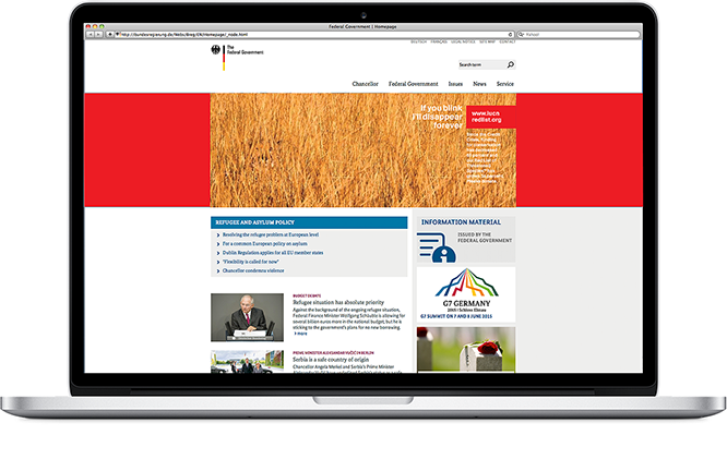
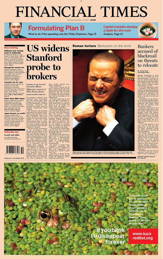
In terms of brand communication, we believe the organsation needs to take a more pro-active approach since many people have concerns about the crisis and how the influx will affect their daily lives. There’s a real need for all parties involved to understand what the organisation stands for … This idea, an interactive documentary site, portrays different opinions and angles on the crisis, all leading to COA’s policy – give shelter and assistance to the asylum seeker. The result is a website which provides a rich interactive experience through a mix of artfully crafted content and media.