Our experience has taken us to work on decisive communication projects from the Netherlands, USA, South Africa, Germany, UK, Belgium, Australia, the Middle East and China. From our offices in Den Bosch, the Netherlands, we intent to produce work that matters and breaks through the clutter.

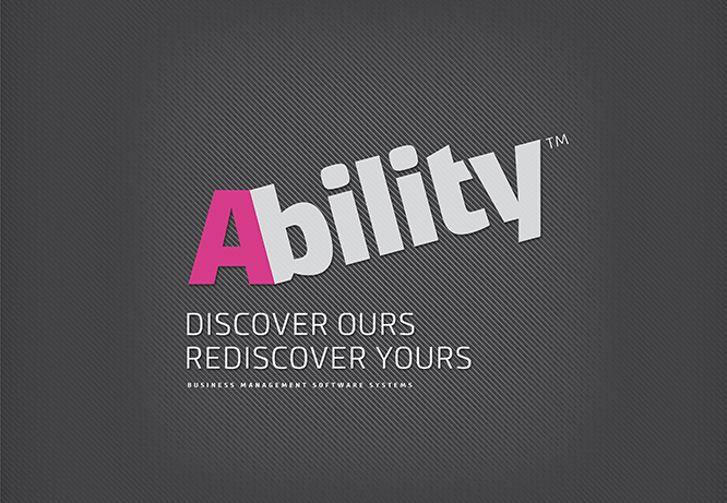
We help leaders develop a difference that matters
Every leader knows that they need to grow value, command healthy margins and gain loyal customers. They do the necessary. They develop their leadership, cut their costs, optimise their supply chains, improve their call-centres…
But is it sufficient? How do they get their hands on ‘a difference that matters’? How do they bring to the boardroom that Holy Grail – a long-term competitive advantage? In their ongoing wrestle, how many business leaders treat their brand strategy as an integral part of their business strategy?
A change of mindset is required. Mark Varder, BHAG Design’s international Brand Strategy Director :
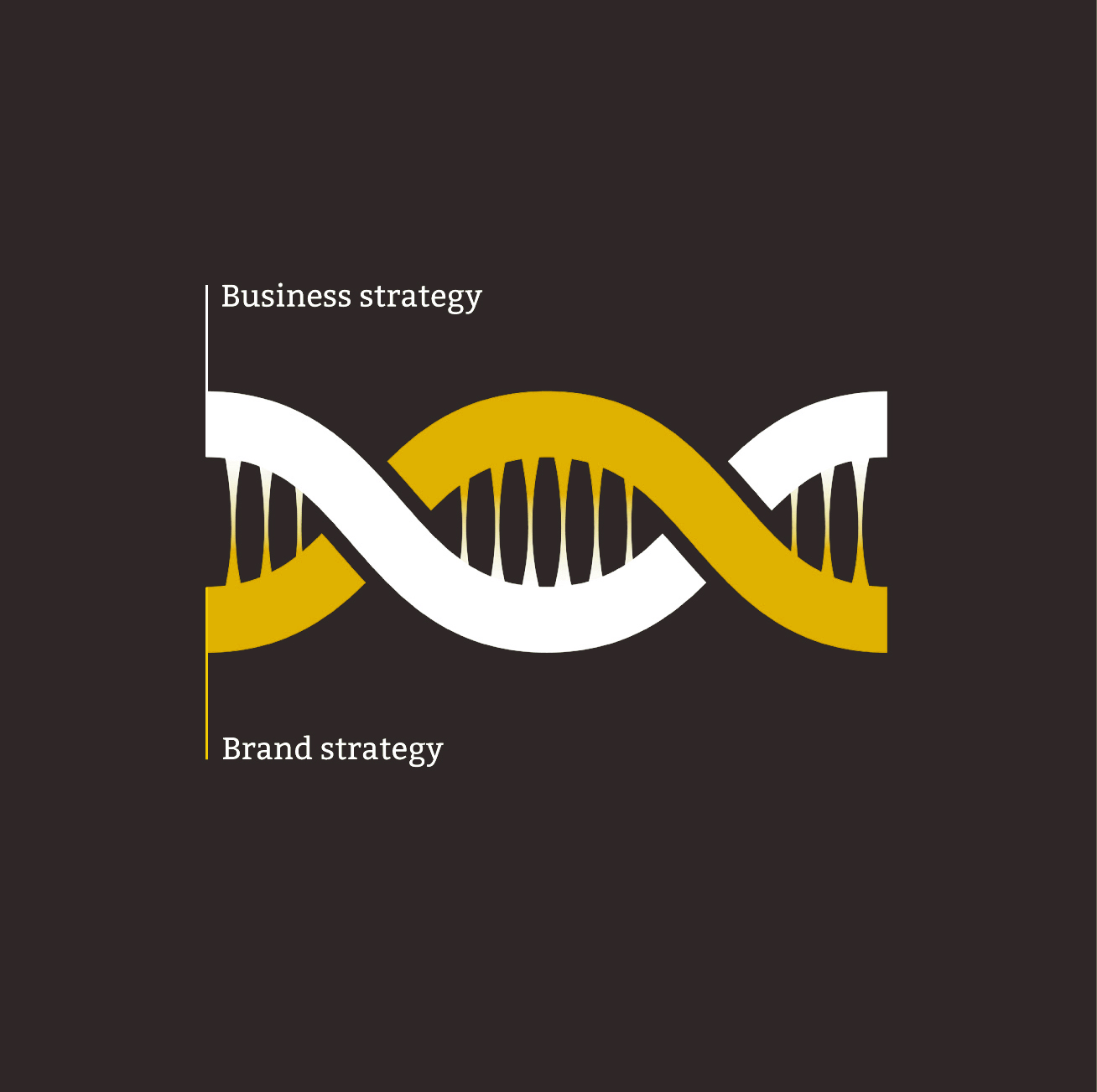
Why would you omit the single largest generator of shareholder value from the development of your business strategy? Far from being the soft stuff, a brand generates 30 to 40 percent of a business’s shareholder value. Your brand has the potential to be your guiding ethos, your difference that matters. Business strategy and brand strategy should be developed concurrently, informing each other. Together they should generate the twin strands of your company’s DNA.
At BHAG Design we believe that your brand commands immense power. It is the sum total of people’s experiences of, perceptions of, and respect for your business … Your business matters. Your brand has the power to make it matter more.
> Feel free to contact us on how we can help your business matter more. Our initial consultation is free of charge and we obviously treat all information as confidential. info@bhagdesign.com <