Editorial design · Graphic design · Web / Interactive design

Radical change at 75

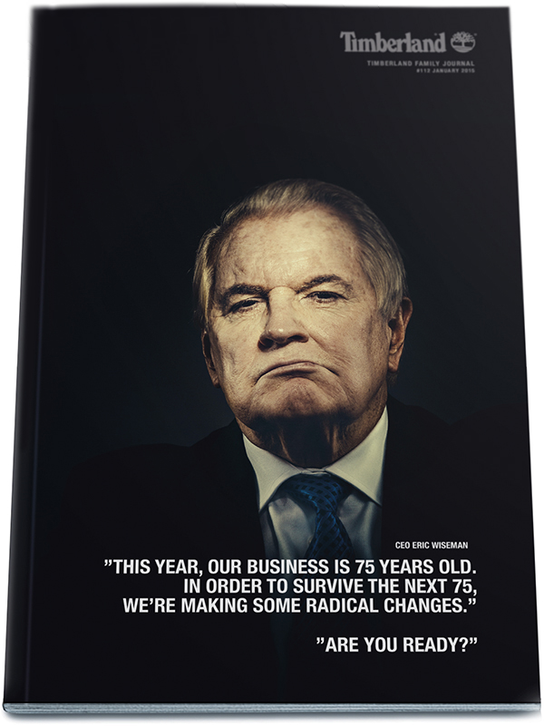
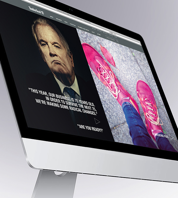
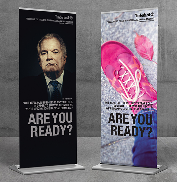
Corporate communication for Timberland, the American manufacturer and retailer of outdoors wear with a focus on footwear. Timberland (part of the VF Corporation) celebrates its 75th birthday and calls all its stakeholders to join the party. However, it’s not all going to be fun. It’s also a good time to learn in person of Timberland’s new business plan that management is envisioning. To learn and understand the strategy behind it. And what it means for you and the future of the business.

At the same event, as part of this new strategy, CEO Eric Wiseman also wishes to announce a new partnership with English footwear maker Puzo. Enough reason to intrigue and make sure people will attend this important annual meeting. Below is a selection of the various elements we’ve done i.e. company journal cover, invitations, congress banners, and various web elements.

TimMAG2 tim22bannerswebelements

Web / Interactive design

Brothers + Sisters: Crazy Passionate about Creating Social Media Campaigns

Brothers + Sisters are specialist social media developers. Their website works best on a mobile phone. They believe the potential for businesses to be successful in social media is monstrous huge, if you know how to do it. First, you need to have some awesome strategic insights at hand that are hard to copy for anybody else. Second, you need a digital partner that can turn these insights into magical content, with plenty of flair and drive. Brothers + Sisters is such a company. Their track record is impressive, their visual skill-sets have won awards the world over… and their people are fun to work with.

The Brothers + Sisters team consists of several technology evangelists, business leaders, tech gurus and industry certified  professionals who are crazy passionate about what they do. The expert team has extensive industry and in-depth local market knowledge. They offer web, mobile and other IT strategies, as well as development services for organisations that range from start-ups to Fortune 500 companies. Launching a website, app or social media campaign can be stressful, but rest assured, Brothers + Sisters have the knowledge and experience to take care of it.1
23

Web / Interactive design

IUCN iPhone app

For the IUCN, the International Union for Conservation of Nature, we rejuvenated the organisation’s purpose and designed a complete new visual grid. One of many elements was to produce this app for the serious conservationist that supplies daily information about the state of the planet. The app provides in-depth access to current ‘hot-issue’ cases across the planet and informs, interacts, guides, and unites all stakeholders to a healthier planet for all. (The IUCN is the world’s oldest and largest global environmental network – a democratic membership union with more than 1,000 government and NGO member organizations, and almost 11,000 volunteer scientists in more than 160 countries.)

The design was built to express the following goals: 1. We wanted to IUCN’s identity to reflect its stature and authority – and to make the organisation look unapologetically modern and professional. Funding from governments and multinationals is critical. 2. The grid of dots represents IUCN’s global network of experts and how the organisation can link them together to create informed decisions. The dots also represent the interconnectedness of life. 3. The images are either from very high up or from very close – to communicate the scale and the detail with which IUCN works.

Advertising · Web / Interactive design

Hulma. Turning the World on its Head.

This is all fictional, but I sometimes wonder what would have happened if my Dad’s fashion business had taken off in the sixties and seventies, when he took over his father’s clothing business called Hulma. What would it be like today? How exciting could it be storing some of the finest brands like Louis Vuitton, Chanel, Wallis, Calvin Klein, Hermes and Girbaud? And how could I help to create powerful communication design would turn the world on its head, attracting customers from all over? E-commerce and advertising / POS elements. Photography by Steve Hiatt and La Chose.

Corporate identity · Web / Interactive design

Food, Fun and Fulfillment from Japan

Communication strategy, naming, logo and multi-media brand launch for Sang Song (Love Food) chain of Japanese gourmet restaurants. As the hottest new addition to Cape Town’s dining and bar scene, Sang Song Restaurant & Bar serves up contemporary Japanese fare created by sushi guru Ken Tominaga, who boasts authentic Japanese training and presents a mix of new-style sushi and classic dishes. Set within a sophisticated designer space in the rejuvenated Woodstock area, Sang Song has been cleverly laid out to cater for solo diners, couples, groups of all sizes and live music performances. Sang Song’s objective is to create an authentic and sensual escapade. We call it Food, Fun and Fulfillment from Japan.