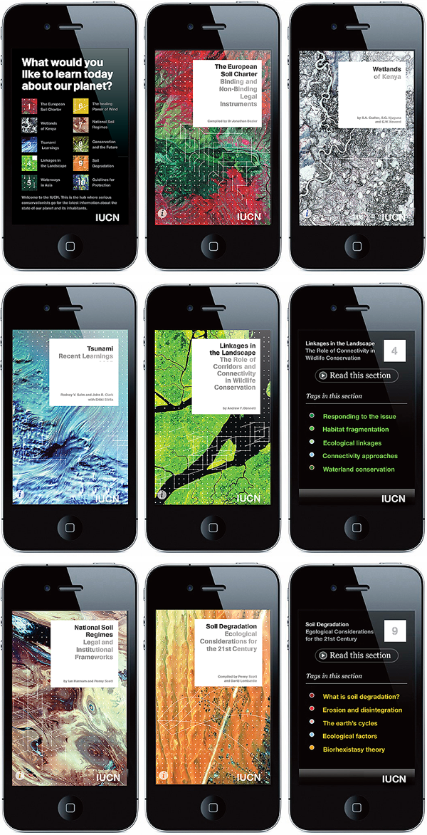
For the IUCN, the International Union for Conservation of Nature, we rejuvenated the organisation’s purpose and designed a complete new visual grid. One of many elements was to produce this app for the serious conservationist that supplies daily information about the state of the planet. The app provides in-depth access to current ‘hot-issue’ cases across the planet and informs, interacts, guides, and unites all stakeholders to a healthier planet for all. (The IUCN is the world’s oldest and largest global environmental network – a democratic membership union with more than 1,000 government and NGO member organizations, and almost 11,000 volunteer scientists in more than 160 countries.)
The design was built to express the following goals: 1. We wanted to IUCN’s identity to reflect its stature and authority – and to make the organisation look unapologetically modern and professional. Funding from governments and multinationals is critical. 2. The grid of dots represents IUCN’s global network of experts and how the organisation can link them together to create informed decisions. The dots also represent the interconnectedness of life. 3. The images are either from very high up or from very close – to communicate the scale and the detail with which IUCN works.

