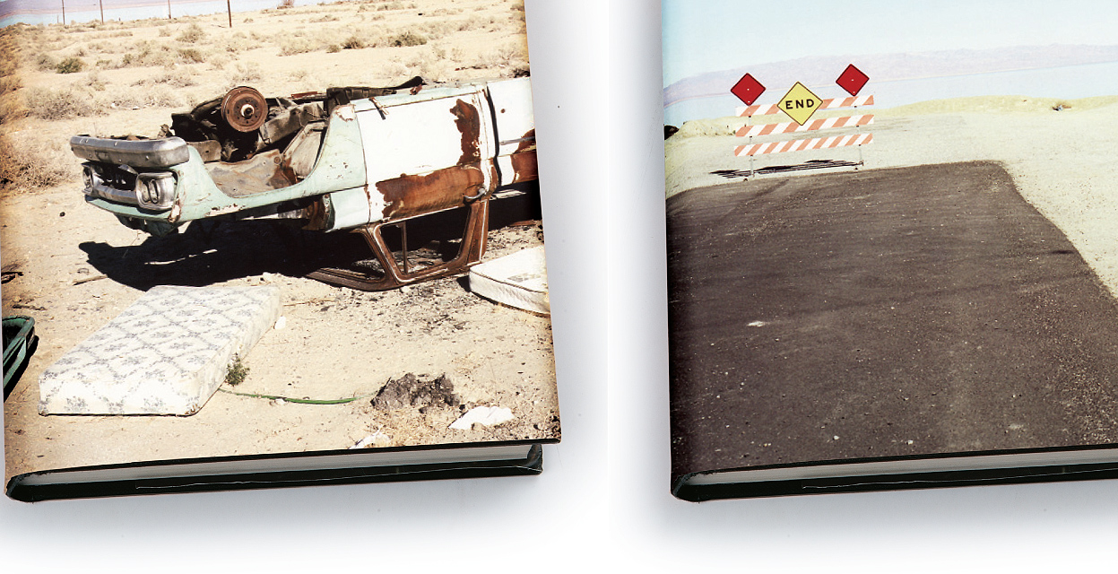
The prestigious Art University of Brussels publishes its 300th anniversary coffee table book. One section about previous student David Vasiljevic was designed by BHAG Design. It holds the story of how a Cum Laude student in Oil Painting became one the world’s top 5 beauty and fashion photographers.
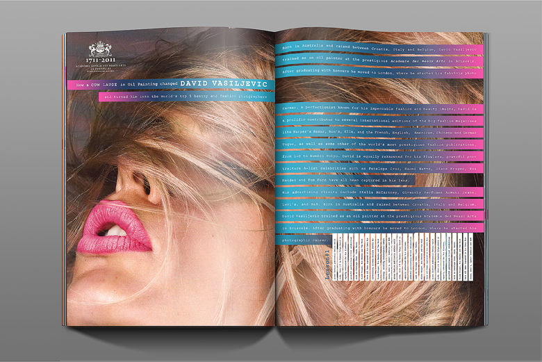
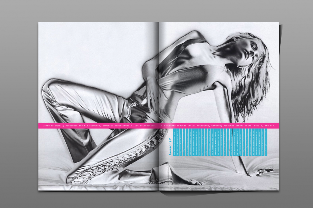
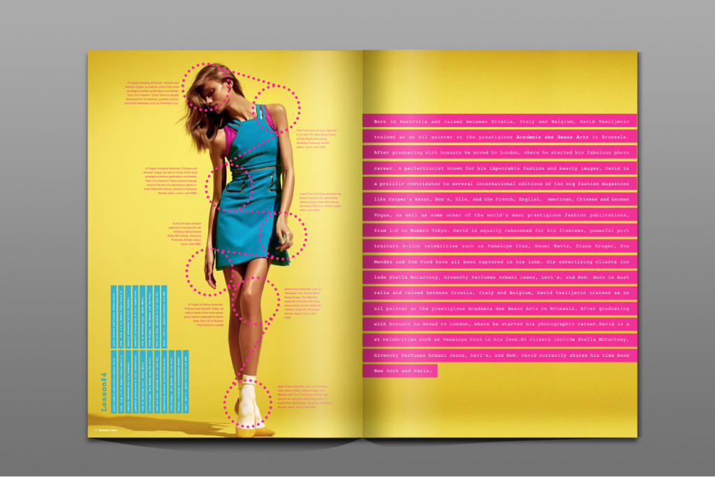
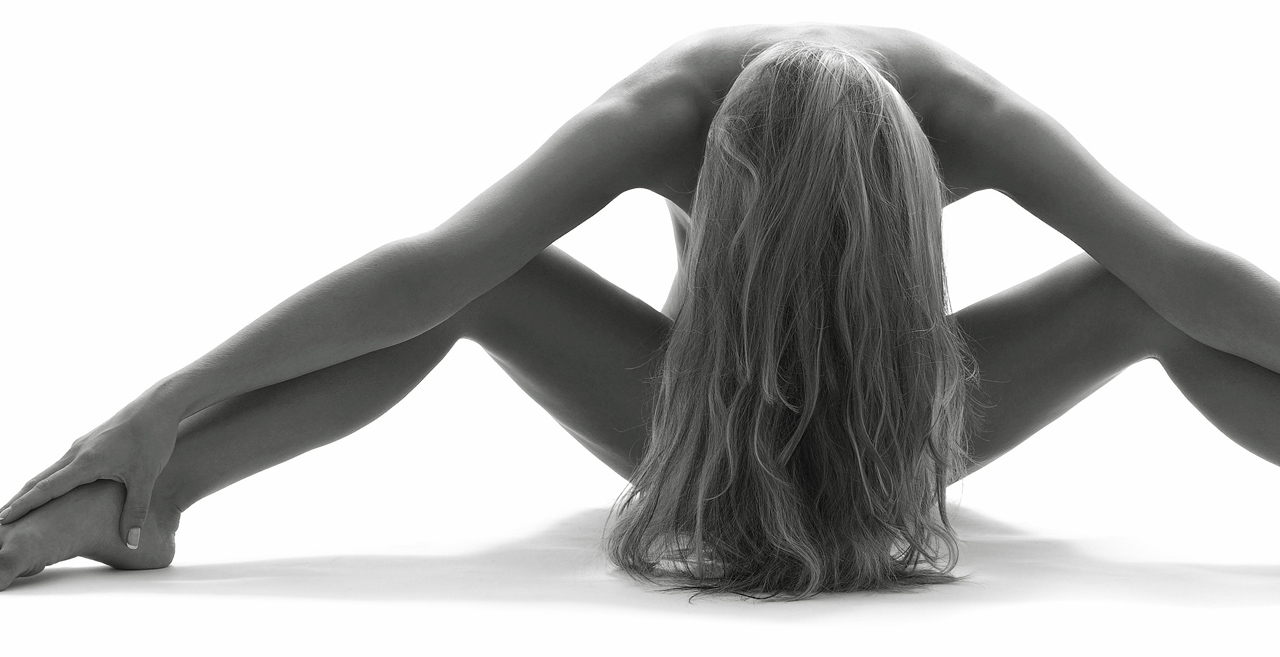
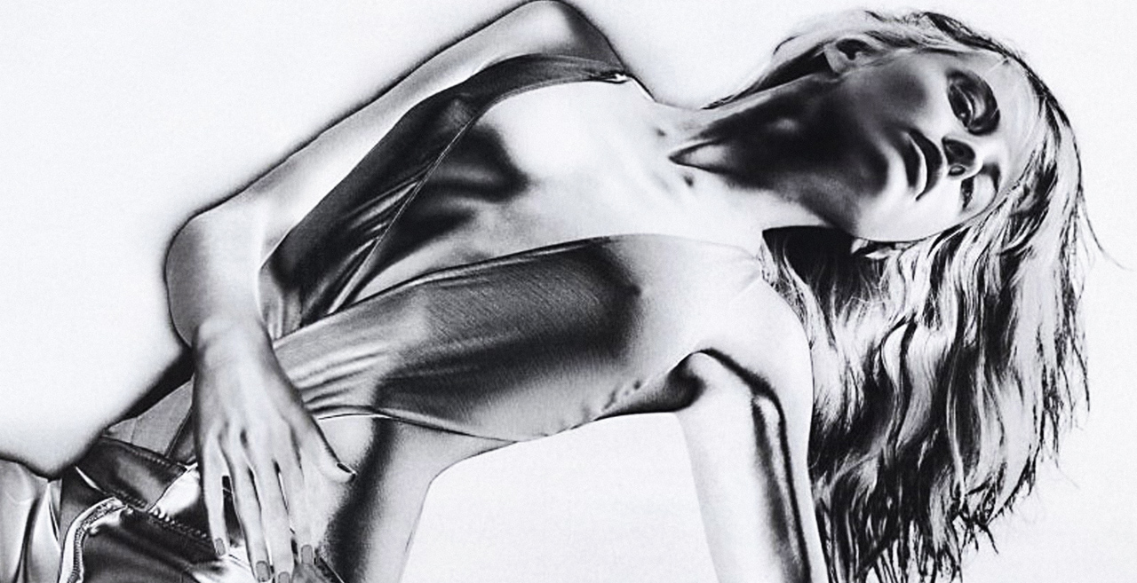
Born in Australia and raised between Croatia, Italy and Belgium, David Vasiljevic trained as an oil painter at the prestigious Academie des Beaux Arts in Brussels. After graduating with honours he moved to London, where he started his fabulous photo career. A perfectionist known for his impeccable fashion and beauty images, David is a prolific contributor to several international editions of the big fashion magazines like Harper’s Bazar, Bon’s, Elle, and the French, English, American, Chinese and German Vogue, as well as some other of the world’s most prestigious fashion publications, from i-D to Numéro Tokyo. David is equally reknowned for his flawless, powerful port traiture A-list celebrities such as Penelope Cruz, Naomi Watts, Diane Kruger, Eva Mendez and Tom Ford have all been captured in his lens. His advertising clients include Stella McCartney, Givenchy Perfumes Armani Jeans, Levi’s, and H&M. Born in Australia and raised between Croatia, Italy and Belgium, David Vasiljevic trained as an oil painter at the prestigious Academie des Beaux Arts in Brussels. After graduating with honours he moved to London, where he started his photographic career.