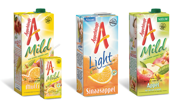
Updated logo and packaging design for Appelsientje. Market leader by far, this brand is the Dutch icon in the fruit juice category since the mid-seventies. Everybody knows what the unusual names stand for: 100% pure orange and apple juice and everybody loves it. However, the existing packaging felt worn-out and needed an stylish shift to stay ahead of its many contenders. Part of the packaging solution was to use Tetra Pak’s aseptic packaging processes – which allow liquid food to retain colour, texture, natural taste and nutritional value for up to 12 months, without the need for preservatives or refrigeration. The superiority of the printing works for us too and allows Appelsientje to express the quality the stands for. For Moka design, Brussels
Category: Packaging design
Reflecting the Music Inside
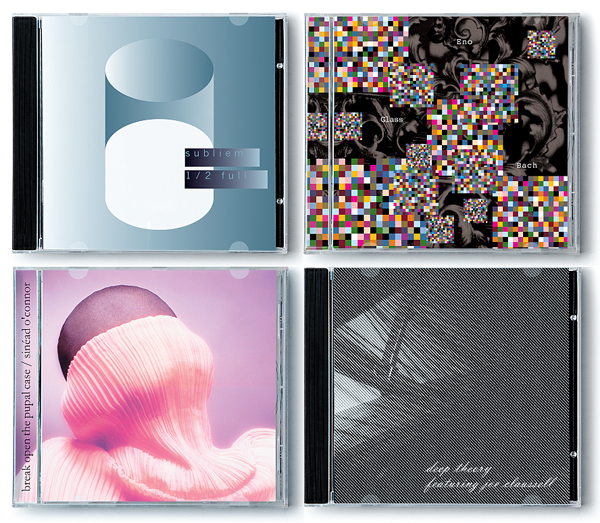
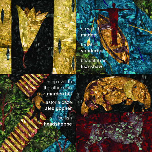
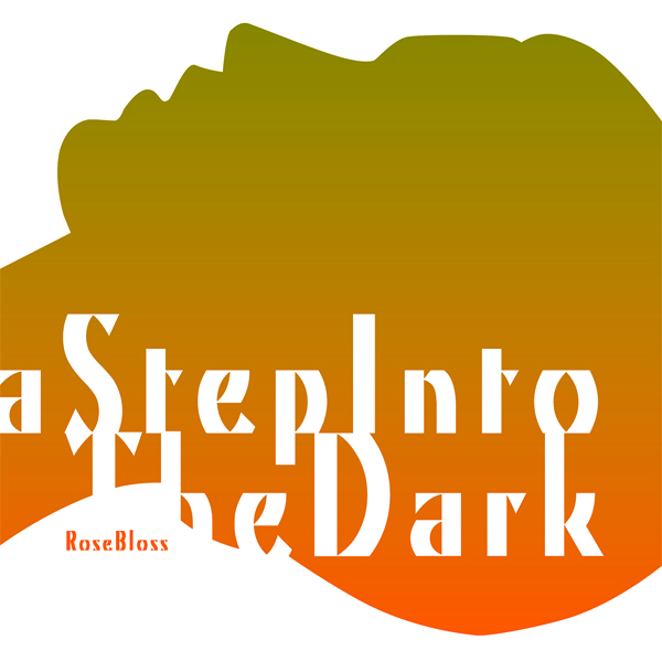
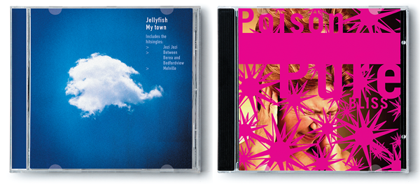
Various packaging designs for Sony Music Entertainment. We’ve been working on projects for Sony Music Entertainment on-and-off through the years – for a broad array of both local artists and international superstars. Photo of Sinéad O’Connor by Michael Meyersfeld. All other artworks by Joost Hulsbosch.

