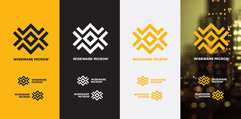
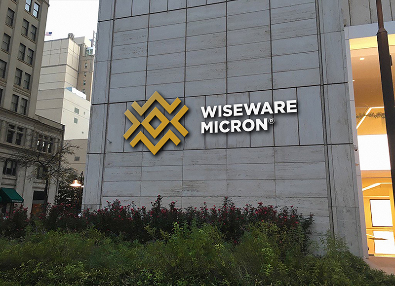
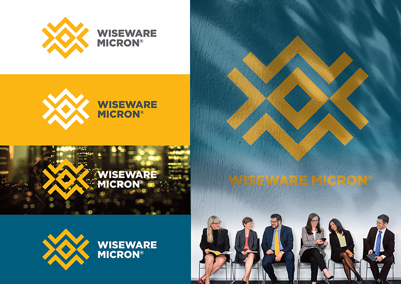
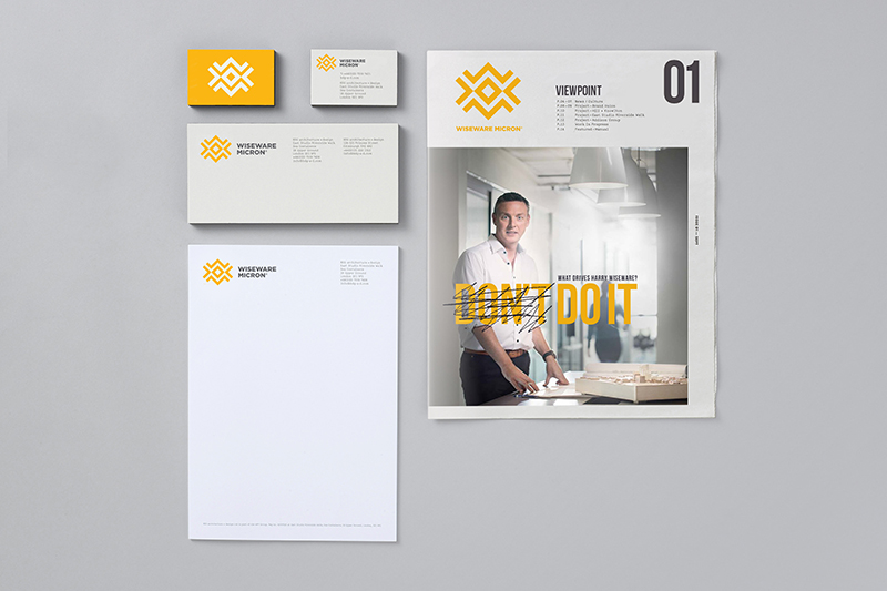
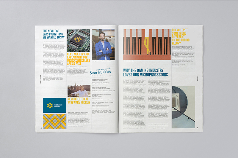
The Corporate Identity brief for Wiseware-Micron® — the Denver based microprocessor assembly & sales startup for SMEs (supported and funded by Intel®) — was clearly defined.
Please make sure our name is somehow reflected in the icon; make clear what a processor does (connect, control and distribute information); and above all, make us look professional and trustworthy to
decision makers . On top of this, a special wish from CEO Harry Wiseware: to somehow not forget about our local native American Navajo roots.
The finished logo features all of the above and overall, shows a well-balanced interplay between the two letters that surround the square microprocessor in the middle. The identity is versatile in usage and reducible to the smallest possible (chip) size. But most importantly, the logo speaks to the strength and directness needed to be memorable and successful in this highly competitive business sector. (Project
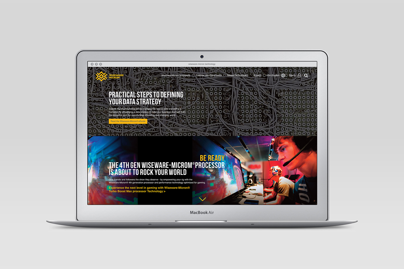
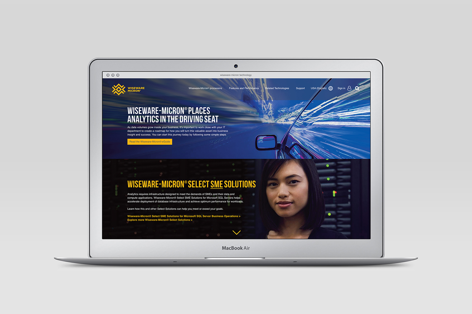
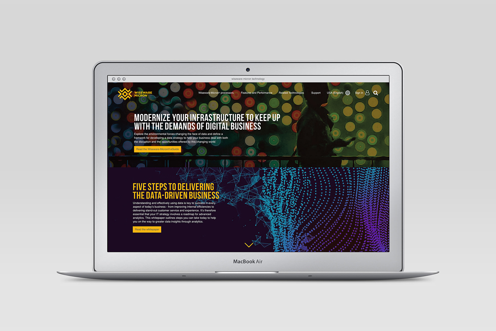
Having created Wiseware Micron’s corporate identity, we turned our attention to their UI/UX site. If we were to enhance their business, we needed to create a site that addressed a multiplicity of end-users, from computer hardware manufacturers to b2b customers. The result is a user experience divided into 6 core markets. Visitors delve seamlessly into their solution-oriented answers, accessing the latest developments in business process optimization.