Advertising · Corporate identity

Get there first

Sony Electronics USA needs to rekindle its innovative spirit, inspire its workforce and position its global brand with a tech-loving society. After a comprehensive immersion into the principles that CEO Sir Howard Stringer was bringing to the Sony corporation, we proposed the demanding, inescapable brand idea:

FIRST1

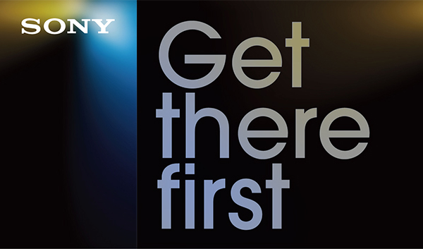
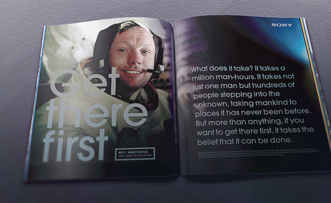
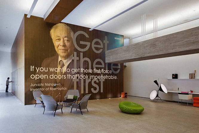
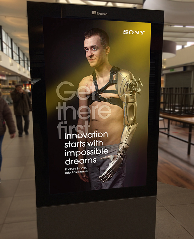
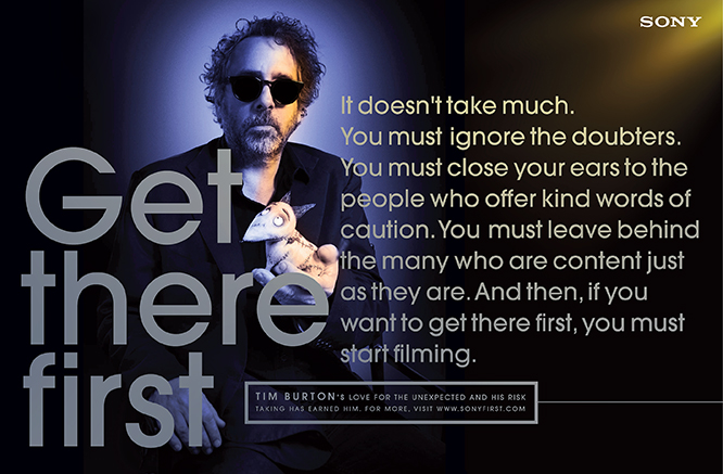
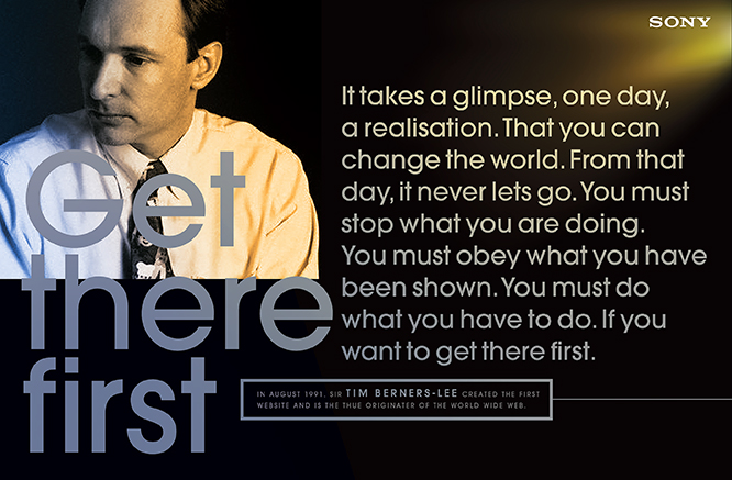
Get There First is about believing that Sony is at the cutting edge. That if you buy a Sony product you are ahead. The words are true of Sony’s heritage. You can believe that Sony, if anyone, got to things first. They invented the whole thing of electronic gadgets. And have continued, more or less, ever since. Both management and employees at Sony Corporation must live up to the company’s idea in order to survive. xperiaFIRST
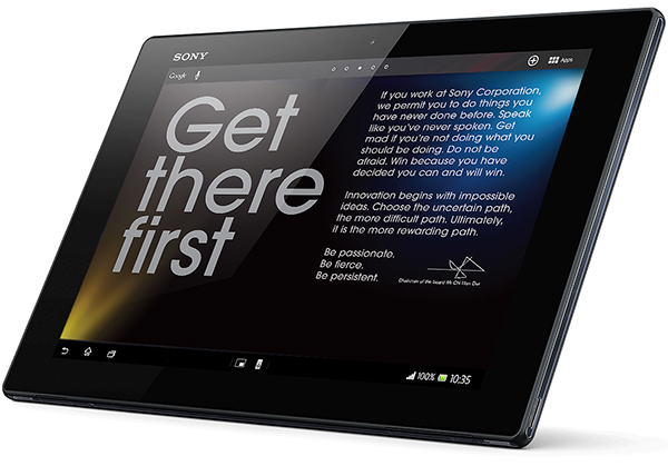
The Get There First campaign is split between internal, external and retail audiences and uses all media components. Building Sony’s reputation makes use of inspiring stories – headed by known and unknown people and often related to Sony’s entertainment and engineering business. Every touchpoint strengthens a new belief in the company’s capabilities and ethos. Get There First expresses the human desire to be one step ahead, to be a boundary breaker, to be an innovator.

Layout 1_Page 2 Layout 1_Page 3

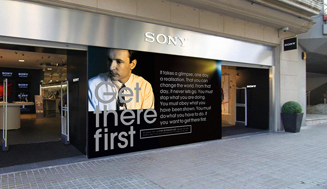
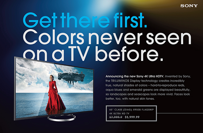
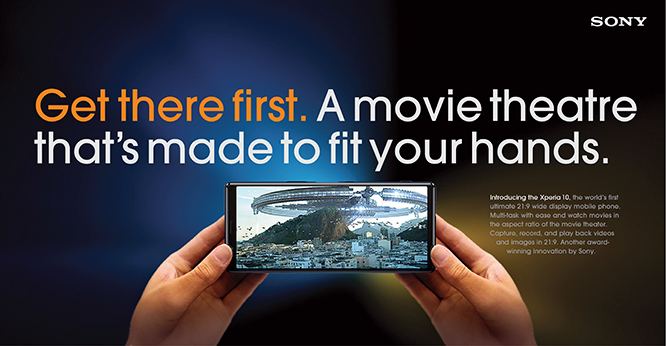
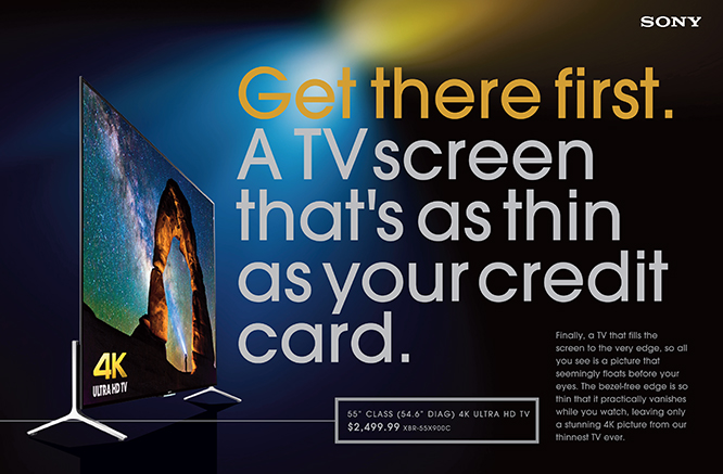
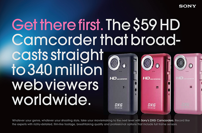
In quintessential retail, the proof is in the pudding. Sony’s intrinsic product benefits form the basis of each message and answer to the brand idea of making lives better through product innovation. Get There First becomes very powerful.

  1. It helps shoppers to reason-why they’re paying a premium for an innovative, superior technological advanced product.
  2. Consumers like to buy into brands that stand for something. Who are on a mission to change the world for better.
  3. Sony acts like an early-adopters brand again. Leading the way. It says, this the way the world is moving, get there first.


For Powerpact LLC Dallas, New York, San Diego

Corporate identity

Infinites

Award-winning logo and UX design for Infinites Music Radio Corp. an DAB streaming music station from Greenwich, CT, USA.

Contemporary technology used to produce a logo that is endlessly fascinating – in the same way that the online music provider uses technology to express an endlessly bewitching mix of jazz and other contemporary music styles. Music for the real music ‘connoisseur’ if you like. Or, as the strap line claims: Music for Dreamers. The service has two subscription plans: a free subscription supported by advertisements, and a fee-based subscription without ads. A free account user may reach the streaming limit of 40 hours per month, and continue unlimited streaming by paying €20. Soon, the company will introduce “Infinites Mobile” for mobile phones and the “Infinites in The Home” wireless computer appliance. Infinites has currently 120,000 tracks in its library and hopes on reaching 5000 users in its first year. Gold winner at LogoLounge Awards 2015

Advertising · Corporate identity · Graphic design · Web / Interactive design

Doing good in food

Mondelēz International, Inc. (NASDAQ: MDLZ) is one of the world’s largest snacks companies, with global net revenues of $35 billion in 2018. Their brand portfolio is deep and wide and accommodates a range of famous chocolate, candy and biscuits brands of which some are more than 100 years old and own market shares of more than 50% in their categories. || As one of the world’s largest food companies, the company takes social responsibility very seriously and are committed to fighting hunger and promoting active, healthy lifestyles. The Mondelēz International Foundation wants to give back and do ‘good’. It takes a collaborative approach to tackle these global problems – working with consumers, companies, governments and leading non-governmental organisations.

This uplifting logo expresses the company’s desire to show another side of their business; an important side that stands and acts with purpose, positivity and integrity. Its goal is to develop a healthier world in where all of Mondelēz’ stakeholders can trust and obtain the confidence that is so critical to the company’s future. || Deliverables: Logo, Stationery, Brand book, Brand messaging, Company collateral and widget-based Website.

mondelez1

Mondelez2

stationary

brandbookbrandbook2

newspapers

Mbillboard_08

MbrochMbroch2

Mwidgetweb

Corporate identity · Graphic design · Web / Interactive design

Ability Business Management Software > CI / UI / UX / DM

Corporate Identity, UI/UX and Direct Marketing concept and design for Ability Business Management Software. Ability™ is like SAP, but for smaller companies. Its uniqueness is found in its inspiring name. In its logo. In its communication.

A decision about a business management system is not taken easily. It’s going to be costly and it’s going to be disruptive. Whether a new system actually works is another matter – there are many horror stories of solutions that took months to implement and of businesses which were worse off after implementation. Which solution to opt for? Considerations include (1) ease of implementation (2) scalability (3) whether the solution is Microsoft-based and (4) return on investment.

The strapline (written by Mark Varder) appeals to the SME’s who are battling to expand and grow their organisations to the next level. Jim Collins describes the problem in his book, Good to Great: “As a company grows and becomes more complex, it begins to trip over its own success – too many new people, too many new customers, too many new orders, too many new products.” Entrepreneurs find themselves bogged down in the day-to-day workings of business and can no longer do the sort of thinking which had established the company in the first place. This insight revealed the deeper problem that needed solving. We had come across Ability’s big idea. Ability. Discover ours. Rediscover yours.  

The logotype. How do you capture the positives of the word Ability and its promises for a business – like growth, progress and solidity? Answer: with a simple, bold, memorable logo design that can stand the test of time.

abilitylogo#11
abilTECH322b

abilsmall#22
AbizcardAbilityHQ

Much of Ability’s marketing is done online. The all-important Ability website contains two menus, 1. Organisational 2. Case histories. – Case histories are crucial to the pragmatist mindset of CEOs and CFOs. They add tremendous credibility to the software and a welcome reassurance that the decision to implement Ability is justified. Below, a few examples of the content we developed.

The website borrows from Christian Stoll’s wonderful large-scale photography. Christian has a knack for finding futurism in today’s techno culture. His objects undergo a metamorphosis, transforming them into visuals of tactile desire.

Layout 1_Page 6 Layout 1_Page 7 Layout 1_Page 8 Layout 1_Page 9 Layout 1_Page 10 Layout 1_Page 11 Layout 1_Page 12 Layout 1_Page 13Layout 1_Page 14Layout 1_Page 15

The Ability Seminars. Once Ability had embraced the ethos, “Discover ours, rediscover yours,” it became clear that this should become the central organising principle for the company. As a result, Ability developed its own insightful workshops for SMEs – added value for leaders who want not only to improve their businesses, but up their game when it comes to strategic and visionary thinking.

Layout 1_Page 4

Corporate identity · Graphic design · Web / Interactive design

Innocity > fascinating expeditions into Dutch innovation

Innocity offers tailor-made tours into Dutch innovation to foreign visitors and company groups looking to expand their horizons. Innovation is alive & kicking in the Netherlands. The country ranks in the top 3 of the world’s most innovative societies and you’ll find break-through examples of this phenomenon across the country. Whether you are interested in agriculture, technology, science or design, Innocity arranges a fully serviced day exploring the brave new world. Go explore!