

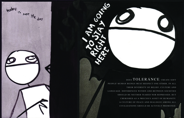
This 24-page booklet explains in simple and engaging language, the Convention on the Rights of the Child, which was adopted by the General Assembly and UNICEF in 1989. The booklet targets children of secondary education institutions across 12 different countries in the Mid and South Americas. The Convention’s 54 articles cover everything from a child’s right to be free from sexual and economic exploitation, to the right to his or her own opinion, and to the right to education, health care, and economic opportunity are part of this education gloss-over. Illustrated by Sam Brown and printed on heavy stock – Translated and published in 12 countries. United Nations 2009, New York, NY.


How can brands nimbly navigate the difficult waters of increasingly fragmented markets? How can brand managers win back some of the control they have lost to consumers in the age of social media?
Take for instance the Gap logo fiasco. The company had to pull back its new logo in the face of intense online backlash from consumers who wanted to keep the old one. By contrast, Starbucks’ rebranding and its new siren logo were mostly evaluated as a success. What then determines the hits and the misses in the new branding era?
The answer may lie in how well companies adopt a “transbranding” philosophy and management system.
“Trans” is derived from Latin and as a prefix means “across, on the far side, and beyond.” We commonly use words like “transportation” and “transfer”; in both cases, “trans” connotes a bridging characteristic, whether it is between places, conditions, or people. Thus, transbranding is using brands to connect and effectively move between divergent markets.
Branding has always been an important part of marketing strategy, since many consumers use brand attributes to determine their purchasing decisions. The branding dialogue in the past was predominantly led by marketers, but in the digital era of today, that discussion is heavily influenced by other voices, such as by social networks. This results often in a varied and potentially conflicting narrative about a brand. Transbranding is a call for marketers to retake the initiative in integrating the communication of their brands across offline and online domains.

Companies or people that are successfully pioneering transbranding demonstrate some key “trans” qualities in the following ways:
1. They are transitional. Sometimes a company and its branding has to evolve to align itself with its changing market environment. When this happens brands have to provide strong leadership to make sure its loyal consumers do not feel lost by radical changes, such as by an unexpected new logo. Whereas the Gap stranded their old customers with their new brand identity, Starbucks initiated a longer, integrated, and open effort to help their partners and patrons to transition to the rebranding effort. More specifically, by keeping the siren, Starbucks signaled that the familiar retail experience would continue. But importantly, by omitting “Starbucks Coffee” in the logo, it communicated that its business also consisted of non-coffee categories — in the present and possibly more in the future.
2. They are transcendent. Instead of just catering to the idiosyncratic demands of the micro-segments created by new media, brands should also try to aggregate consumers by finding an appeal that can transcend market differences. A recent Harvard Business Review blog about Gangnam style discusses how a video sang almost entirely in Korean nevertheless became a global viral sensation because, at the core, the music, the humorous visual content, and the artist Psy himself were all universally liked. Brands, too, have to search for that kind of power to attract across seemingly variant markets.
3. They are transformable. With digital domains, like smartphone apps, becoming a new and important battleground, branding elements now need to be visible in a much smaller or dynamic setting. Case in point: DC comics now uses a “living identity,” where its new peelable logo reveals its many superheroes. Whereas its former identity was singular and static, the new malleable brand ID can be flexibly fit to properties, characters, and media, such as in digital devices, where consumers can playfully interact with it.
4. They are transparent. Domino’s Pizza created a stir by conducting a bold campaign where it openly discussed the consumer dissatisfaction and quality issues facing the brand and how it was going to overcome them. Brand transparency is important in honestly addressing consumer complaints, especially since, when left alone, they can be spread quickly on social networks. Companies, however, need to determine the proper level of brand transparency by weighing its impact on other branding factors, including trust, mystique, storytelling, and surprise.
While it is true that the changed media landscape has made life difficult for marketers, the good news here is that a transbranding mind-set can help managers cross over the old-school and new-school branding divide.