Corporate identity · Web / Interactive design

A solemn promise for the Central Asylum Seeker Agency in the Netherlands (COA)

Concept, logo, UI/UX design proposal for COA, the Central Agency for Asylum Seekers in the Netherlands. The COA assures that asylum seekers are accommodated and supported in a safe environment. This is done in a manner that remains controllable to both politics and society as a whole. Although the current influx of refugees is at an all-time high – and puts the organisation under tremendous strain – it’s also felt that both identity and communication strategies need to be altered in order to communicate a more solemn stature with the nation and all of COA’s stakeholders. 

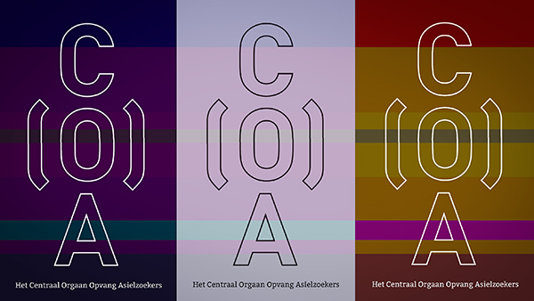
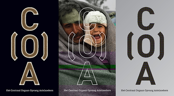
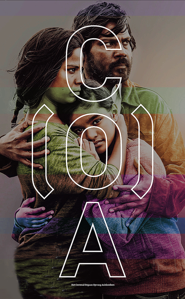
In terms of designing a new identity, the job is to express an steadfast organisation that provides safe (but sober) shelter to vulnerable human beings on the run from war and destruction. Maybe you can view the stacked letters as an abstract person standing firm, but that’s not what this logo is about. The caring accolades around the O (from Opvang = Shelter) is what the organisation in all about.
COA11postercoalogo2COA600

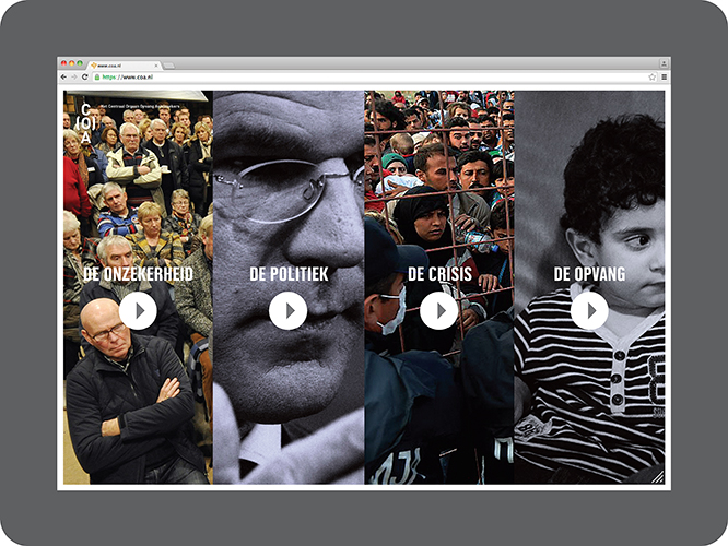
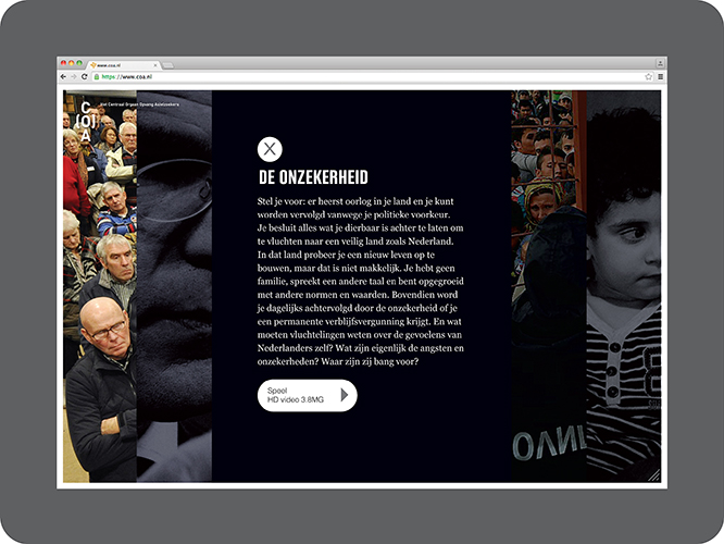
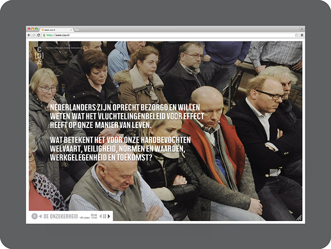
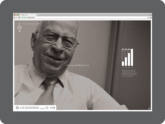
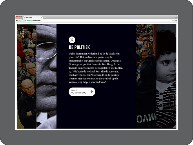
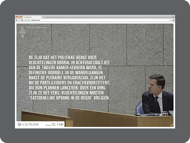
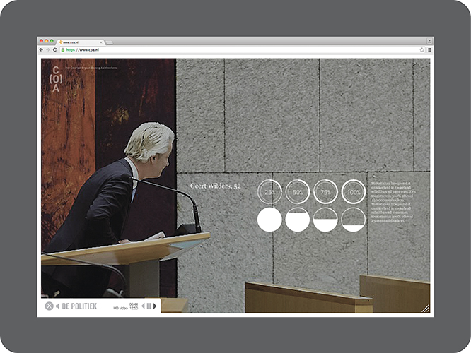
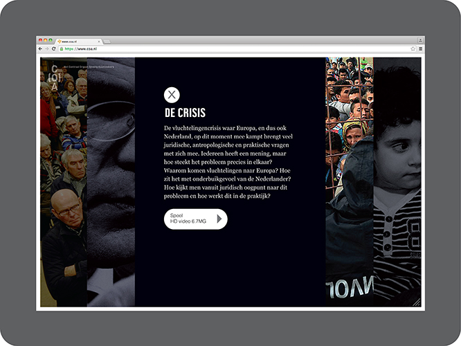
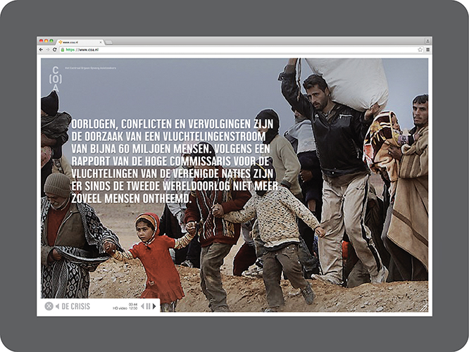
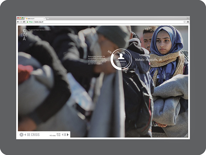
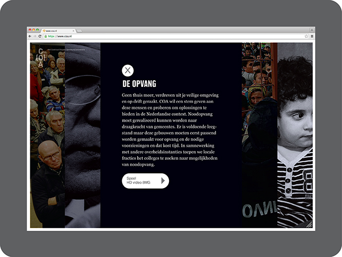
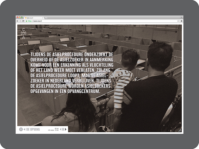
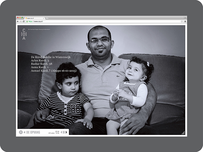
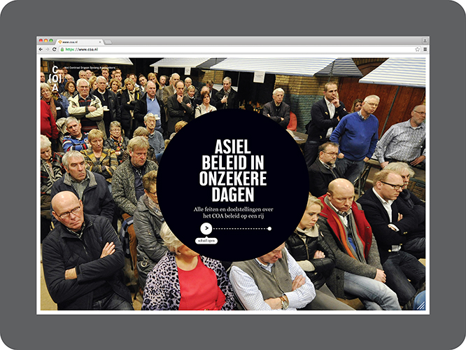
In terms of brand communication, we believe the organsation needs to take a more pro-active approach since many people have concerns about the crisis and how the influx will affect their daily lives. There’s a real need for all parties involved to understand what the organisation stands for … This idea, an interactive documentary site, portrays different opinions and angles on the crisis, all leading to COA’s policy – give shelter and assistance to the asylum seeker. The result is a website which provides a rich interactive experience through a mix of artfully crafted content and media.
Layout 1_Page 2

Layout 1_Page 3

Layout 1_Page 4

Layout 1_Page 5

Layout 1_Page 6

Layout 1_Page 7

Layout 1_Page 8

Layout 1_Page 9

Layout 1_Page 10

Layout 1_Page 11

Layout 1_Page 12

Layout 1_Page 13

Layout 1_Page 14

Layout 1_Page 15

Corporate identity

School 2.0

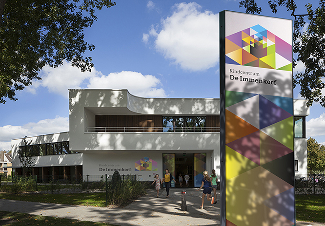
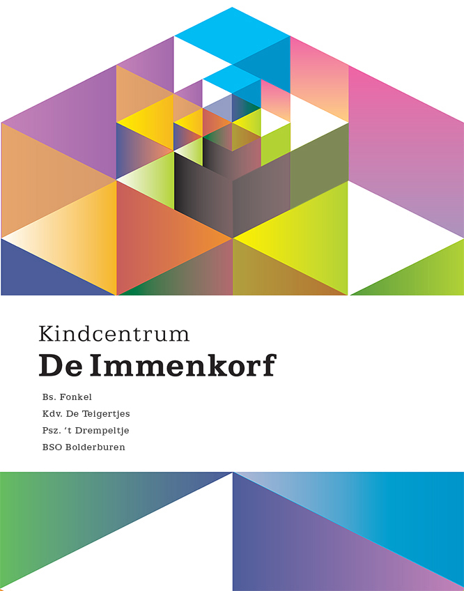
In the Netherlands, pre-primary, primary and elementary schools are combining their efforts into one building. It provides young learners (2>12yrs) a seamless educational experience which produces higher standards, united communities, and confident children ready for the next stage in their lives. This value sharing system also combines individual budgets that result in just more spending power for building, sports and IT facilities which benefit all stakeholders. We did the naming and logo design for De Immenkorf in Den Bosch. Geometric shapes, enriching colour schemes and maturational symbolism bring this new style school to life.

Michaelschool, Hillegersberg, Rotterdam, de Zwarte Hond architecten, ©2014immenkorflogo

Corporate identity

Art Directors Club Netherlands

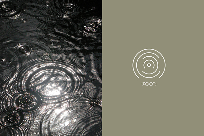
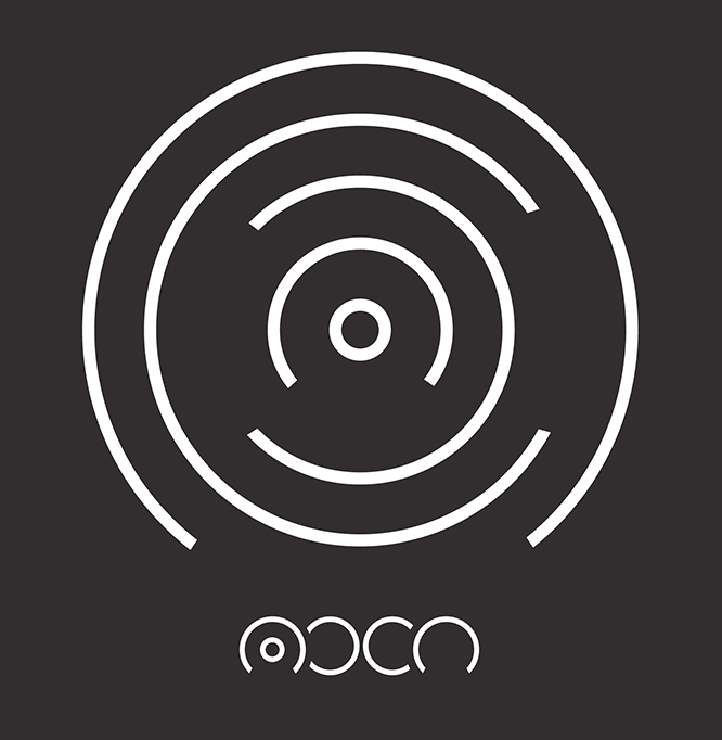
Our logo proposal for the Art Directors Club Netherlands (ADCN). The circular typeface we designed for the letters is an engaging solution in itself, but when the letters are combined as expanding concentric circles they express the ADCN’s mission to promote, stimulate and expand the influence of creative excellence in the Netherlands.

Corporate identity · Graphic design

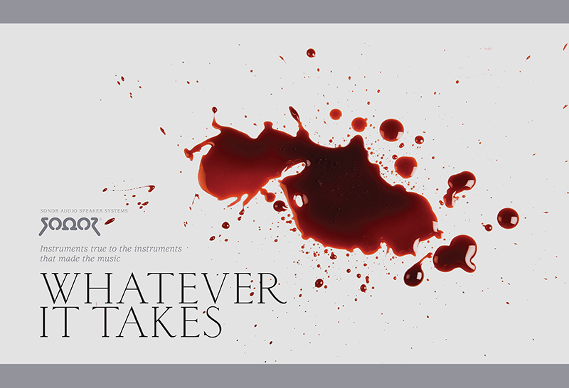
Instruments true to the instruments that made the music

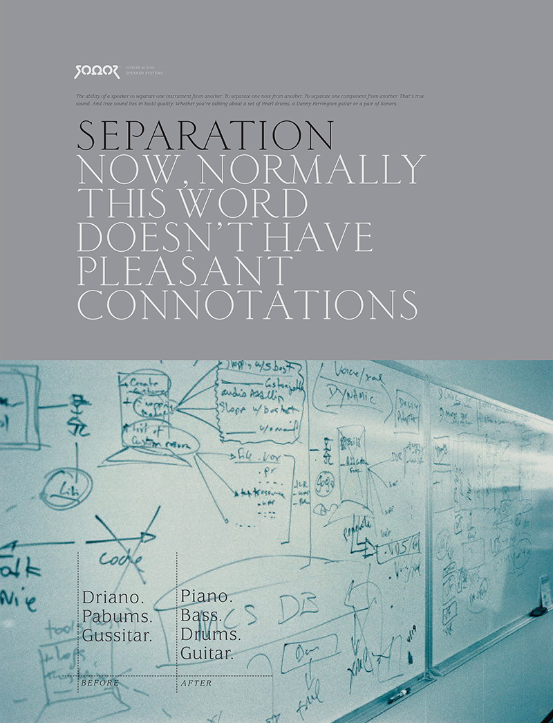
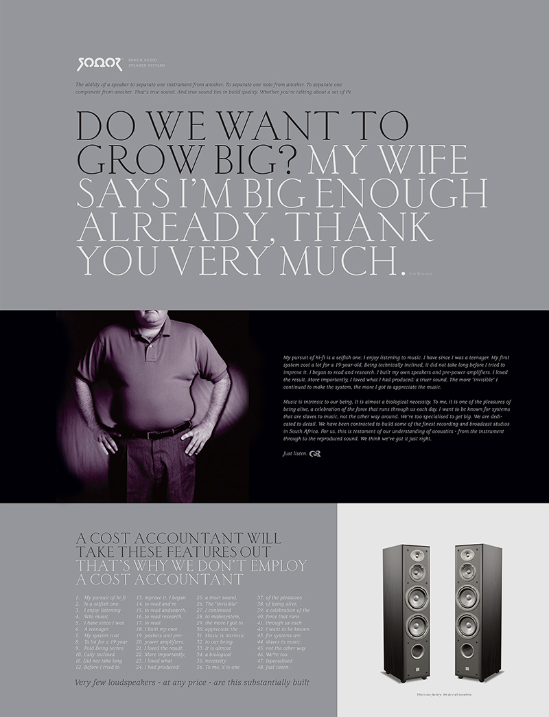
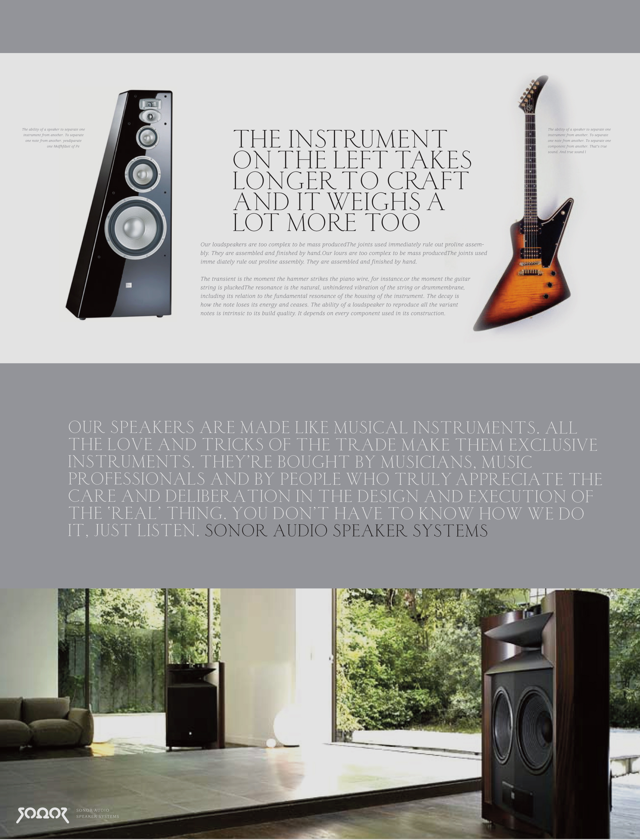
Logo identity and communication platform for Sonor Audio Speaker Systems, a passionate Johannesburg loudspeaker manufacturer that breaks the mould by making quality products that can easily compete with some of the world’s top brands. Sonor is (and behaves like) a small, niche and artisanal ‘discovery brand’ that talks to new buyers hungry for new and authentic products. At BHAG Design, our job is to create and retain the authenticity and spirit of the brand.

Sonor’s robust, equally levelled logo design tells the story of Sonor’s quest for perfection. At the centre of it all, the empirically derived Ohm technology – with unique capabilities to beam separated stereo sound – is further crafted with a high degree of symmetry and precision. On balance, in our view, the logo reflects both beauty and brains.

‘Whatever It Takes’ is Sonor’s basic communication platform. It tells the story of the relentless pursuit to perfect sound reproduction; the technology and craftsmanship, but also the blood, sweat and tears that were shed to reach the goal of producing a product – both in technology and aesthetics – that can compete with the best in the world. Sonors are exclusive, hand-made speakers that are made like the musical instruments themselves. The strapline: Instruments true to the instruments that made the music, captivates the company mantra and runs throughout all communication elements. Copy strategy/writing by Mark Varder

Corporate identity · Graphic design · Thinking

We help businesses reach their full potential – through the power of purpose-driven communication design

Every company needs a purpose. Something beyond making money. It needs to be driven. It needs to make a difference.

But what is your purpose? Do you have one? When you own a purpose, you stand for something that is based on clarity and honesty, promise and delivery.

Great articulation of your purpose is everything. It will set your company apart from your competitors. The work must be positive, inspiring and charismatic. It must have beauty and brains. It must catch the eye and solve the business problem at the same time.

We have strong strategic instincts with an understanding of customer experience methodology, branding and advertising. We are fluent in industry and production processes, software, benchmarks, history and conventions. We are collaborative and are able to work with teams across different markets.

For inspired and focused communication design, look no further. Our work gets continued global recognition from our peers and industry press.