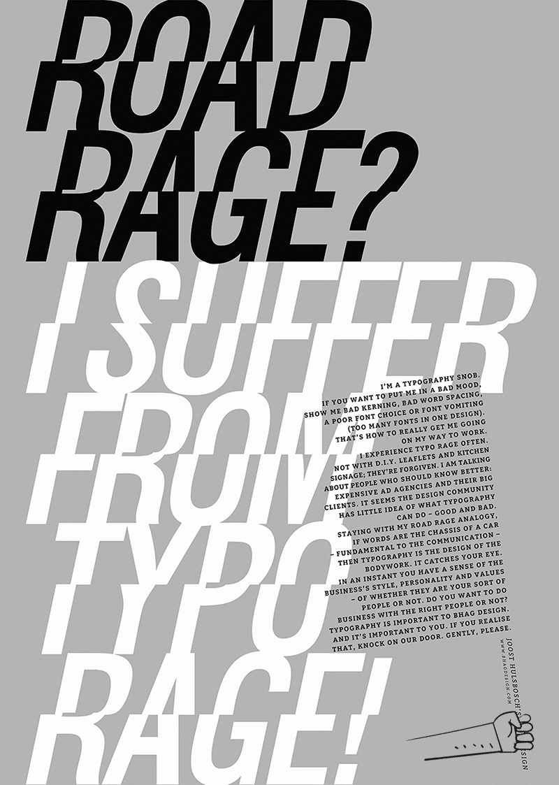
Typography has always played an important role in how I help companies to express themselves more distinctively. Good typography adds character and self-esteem to the message. But typography is often misused in mass communications, made by big expensive agencies that should know better. Poor font selection, poor kerning, and poor word spacing are the typical eyesores that infuriate me. Time to speak up and notice. Award-winning Poster (self-promotion) at the Type Director’s Club 2017. Concept and design: Joost Hulsbosch, copy: Mark Varder

