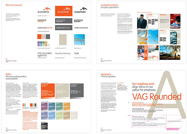
Creating a logo for ArcelorMittal — the world’s largest steel company, with over 320 000 employees and a presence in more than 60 countries — is no small undertaking. Assigned by FutureBrand, we’ve conceptualized and designed this ultra simple, yet powerful signature device.
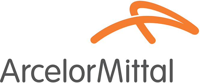
How did we get here? The Mittal family are understated people, so it was essential to have something dignified, but also strong, clean-cut and world-class. That’s why we came up with the idea of the signature which at closer inspection is made out an A and an M. The ArcelorMittal signature is unique to the company, just as an individual’s handwritten signature is unique to them. Designed to suggest the transformational energy that characterises the company, the signature’s dynamic and iconic form reflects ArcelorMittal’s leadership position in the steel industry.
We developed a brand website that has downloadable applications, typefaces and tools. We can also upload additions and make modifications when necessary. The result is a very flexible brand tool, with the benefit of being instantly accessible anywhere in the world.