The IUCN, based in Geneva Switzerland, is the world’s largest environmental organisation — it has 1,200 government and NGO members and 11,000 experts in 160 countries around the world. We wanted IUCN’s identity to reflect its stature and authority – and to make the organisation look unapologetically modern and professional. Funding from governments and multinationals is critical.
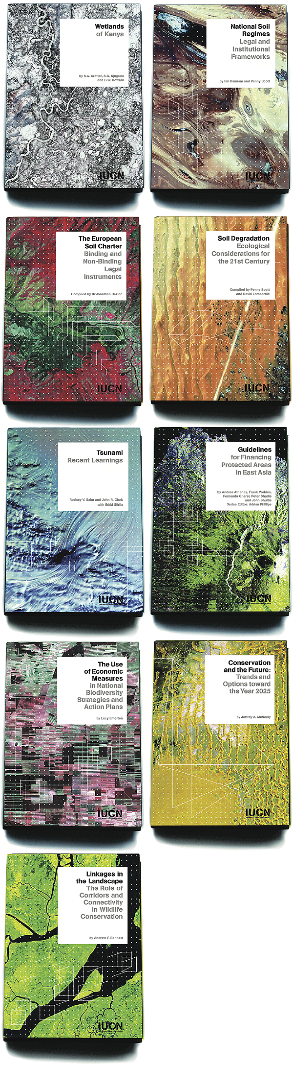
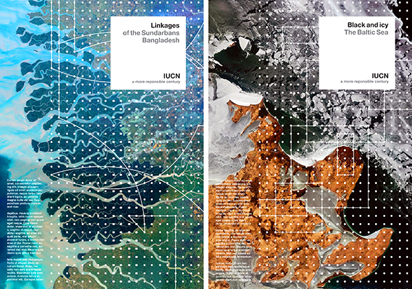
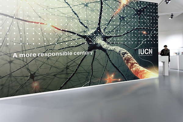
The grid of dots represents IUCN’s global network of experts and how the organisation can link them together to create informed decisions. The dots also represent the interconnectedness of life. The images are either from very high up or from very close – to communicate the scale and the detail with which IUCN works.
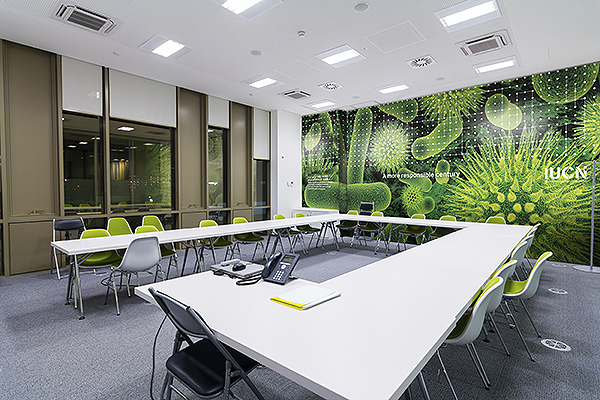
In addition, we introduced IUCN to a phrase that, after the environmental degradation of the 20th Century, would sum up their contribution to the planet going into the new millennium: A more responsible century.
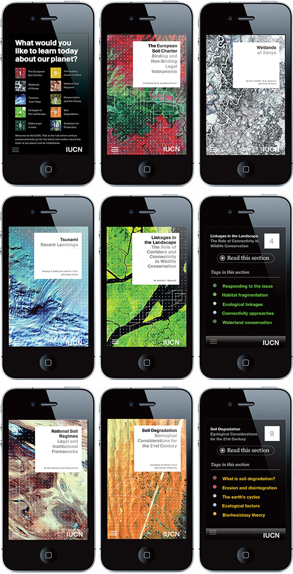
The IUCN produces annually more than 100 books and journals out of their London publishing house. This design provides the organization with a coherent and democratic look and feel.